


Drugi jezik na kojem je dostupan ovaj članak: Bosnian
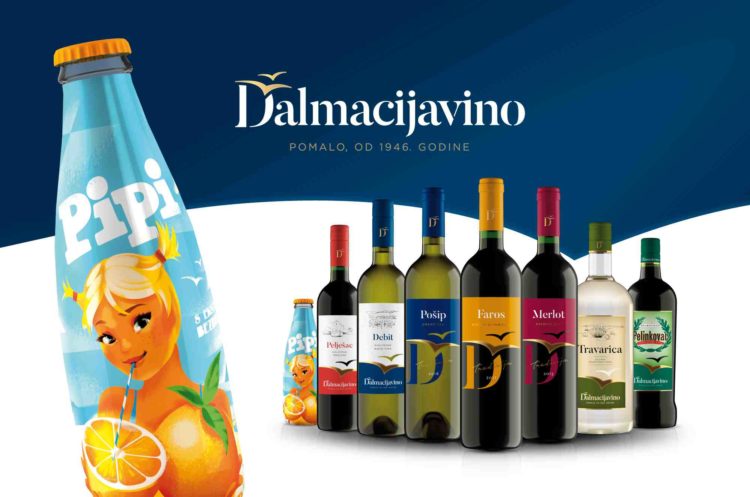
The second most powerful Dalmatian brand after Hajduk, according to popular opinion, is the Dalmacijavino, and it started the new year with a new visual identity, designed by advertising agency Imago Ogilvy and their specialized department for packaging and branding – ImagoBox.
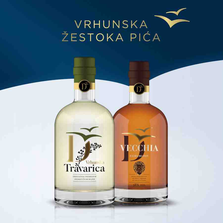
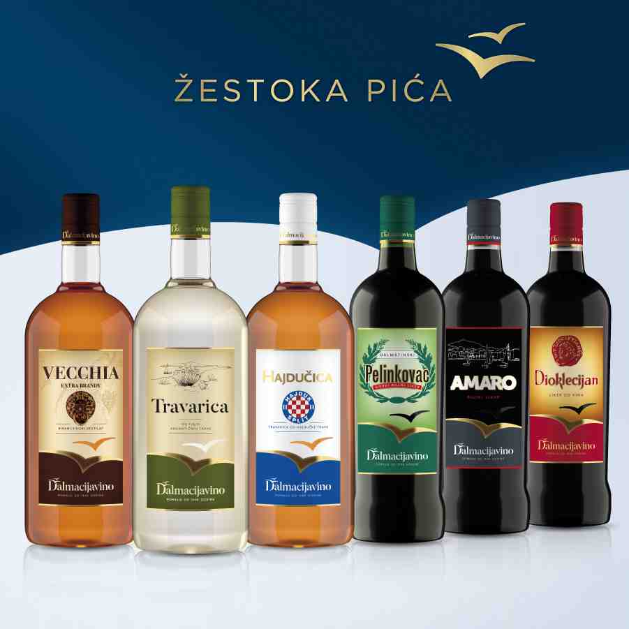
Rebranding of the company was only a prelude to something much more important, and that is the redesign of their full range of wines, spirits, and the legendary Pipi.
The foundation that is built into the design of each segment is the main philosophy of Dalmacijavino, summarized in its slogan “Pomalo” (“Easy does it”). This simplicity and ease is visible on each label, regardless of the fact that they differ in style depending on the category.
“While relaxed lifestyle has become a real rarity in today’s hectic time, Dalmatia still offers us a chance to experience this unique relaxation and philosophy of life at least for a moment. It reminds us that life is too important to understand it too seriously, and that nothing horrible will happen if we stop for a moment and relax a bit. It encourages us to live in the moment and to focus on what we are doing, because life is what’s happening right now.
“If we were to reduce this life philosophy into a single word, we end up with our new slogan, which says Pomalo …. This can be seen in our new design. We freshened up and pampered up a bit, but we also kept the same Dalmatian spirit that is in our roots,” Dalmacijavino said in a statement.
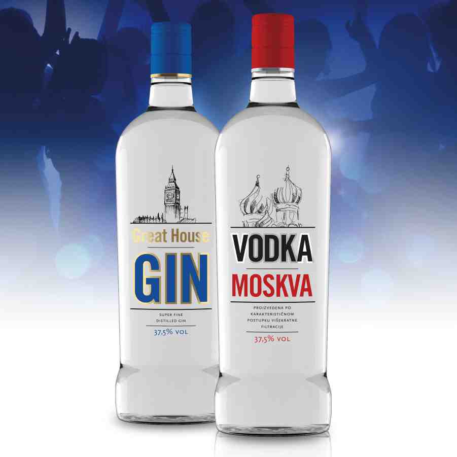
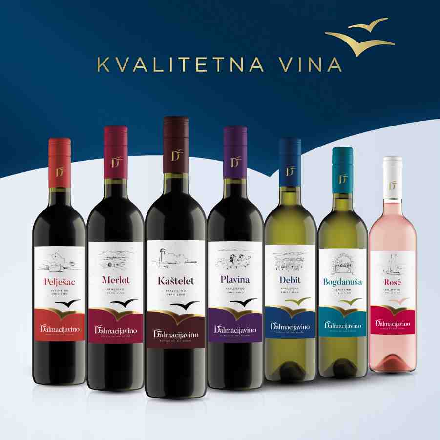
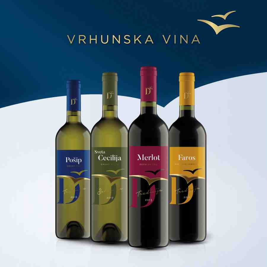
Building on this philosophy, the agency designed new labels for wines and spirits, and the leitmotif in all labels is an unpretentious sketch that reveals a relaxed brand.
“Although seemingly simple, a sketch requires great skill and experience to say a lot in just a few lines. In this way, we metaphorically talk about products of Dalmacijavino, adorned with similar characteristics, simplicity and unpretentiousness, but also high quality and tradition.
“Labels are substantially related to the origin of grapes and vineyards, and already on the packaging you can identify the authenticity of local varieties and localities which for decades now enrich the moments of socializing with good wine,” explained Krešimir Đurić, Art Director on the project.
Redesign of the Pipi label was a special story – done with a lot of love.

“The design of the new Pipi – one of the most popular drinks of times past – has retained its distinctive retro charm, but it also made it into a modern drink for a new generation. In the center of the new label is the character of Pipi girl, who is now more mature, but still just as playful and carefree. She boldly asks us to join her in moments of carelessness and summer relaxation. This iconic Dalmatian orange juice is now adorned with a modern illustration by a world famous retro style illustrator, Mads Berg. As a result, Pipi retains the spirit of the golden days, but in a modern way reflects the charm of Dalmatian peace of mind. With the new design, we wanted to show that the summer fun, sun, sea and company is what makes Pipi different and special even today. Simply put, Pipi is a retro drink for a new generation, with an added extract of carelessness,” stressed Darko Bosnar, Art & Innovation Director of Imago Ogilvy.
“This was a terribly difficult task, because not only does it have that professional component that is necessary, but also an emotional one that cannot be ignored. You’re aware that you are messing with something that is sacred for a city and an entire region – it’s a sanctity of many generations, and that’s something you have to respect. Just remember the recent stories with rebranding of Juventus and reactions of fans. Exactly because of that we have paid enormous attention to every detail, every letter and every line. We professionally did the job that was expected of us, and most important and best thing is yet to come, when people of Split take Pipi in their hands and be proud of it,” said Igor Mladinović, Chief Creative Officer of Imago Ogilvy.
“From the standpoint of strategy, redesign of the umbrella brand of Dalmacijavino and its entire range has been an extraordinary challenge. Our goal was to position and redesign the brands that will also be attractive to the new, younger generation, but also the older loyal consumers. We wanted to make Dalmacijavino and Pipi modern brands, with values that have always existed at their very core and with most loyal consumers, but were never clearly spoken or visually presented. This project, in addition to professional, for me was also exciting on the personal level, because I’ve literally grown up with products of Dalmacijavino in Split,” said Iva Bokšić, strategic planner at Imago Ogilvy.