


Drugi jezik na kojem je dostupan ovaj članak: Bosnian
Source: Adweek
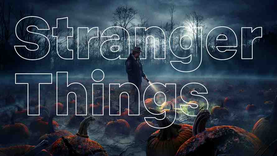
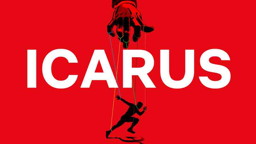
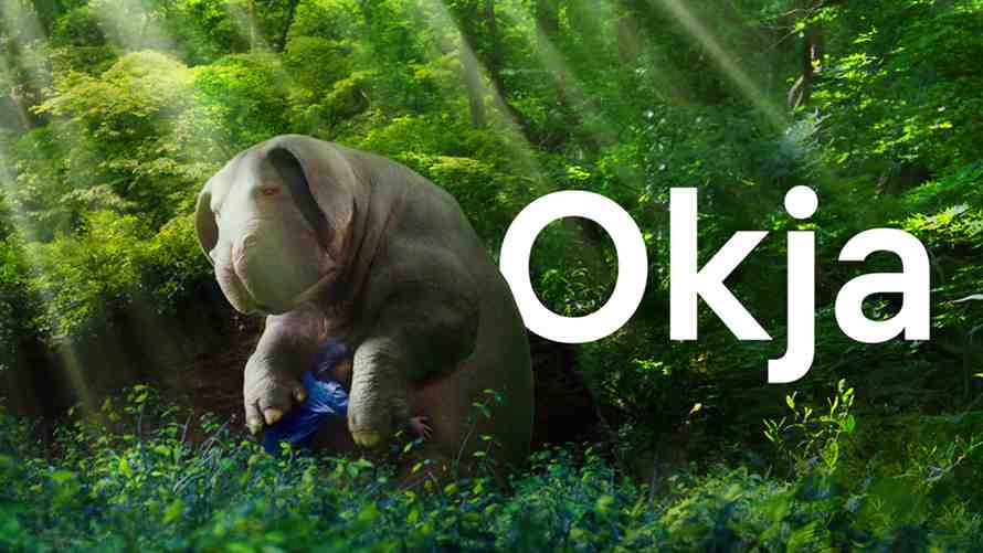
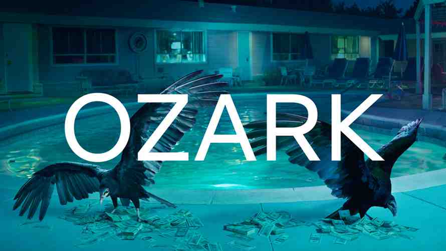
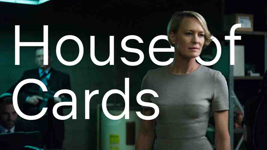
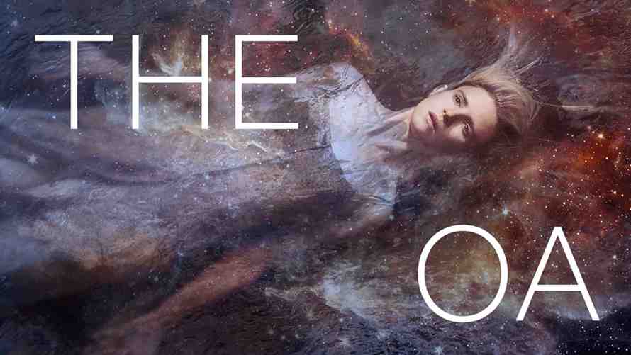
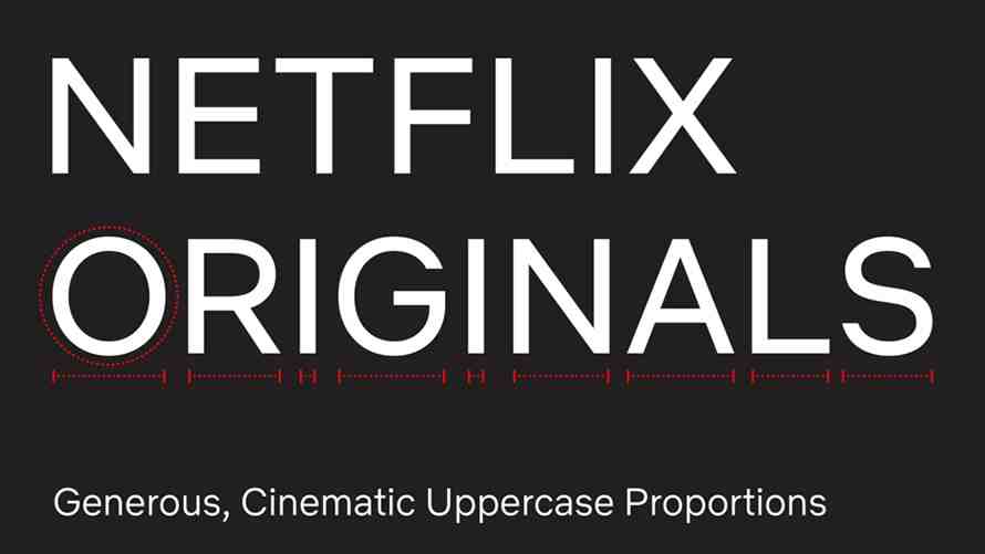
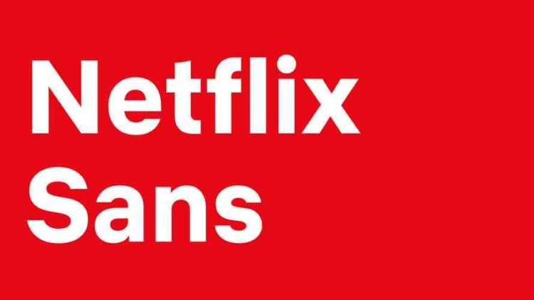
Netflix has developed a custom font called Netflix Sans which brings a promise of big savings for the world’s most popular streaming company. The clean and functional font that includes elements of the brand’s iconic logo will now be used in company’s content, and perhaps the most important aspect of it is that it’s economical.
Noah Nathan who worked on the design explained the economic side of this move on his website, noting the costs connected with font licensing around the world. „Developing this typeface not only created an ownable and unique element for the brand’s aesthetic (moving Netflix away from Gotham, which is widely used in the entertainment industry), but saves the company millions of dollars a year as foundries move towards impression-based licensing for their typefaces in many digital advertising spaces.“
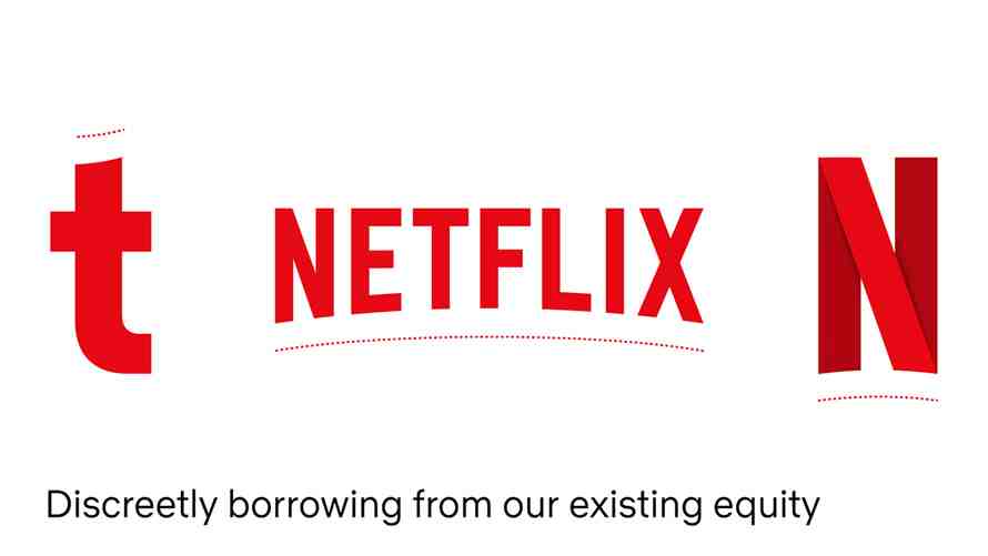
One of the new font’s elements that both Nathan and Adweek noted is the curve on the top of the lowercase „t“, which borrows its aesthetics from the iconic Netflix logo.