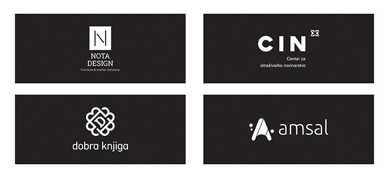
On Thursday, April 25th, at 17.00 hrs, the Bosniak Institute in Sarajevo will host an exhibition of logo designs by graphic designer Amir Hadžić.
Amir Hadžić is a designer with 20 years of experience. Throughout his career, he has worked for a large number of domestic and foreign clients including: MGallery by Sofitel, ibis Styles, Residence Inn Marriott, Dekra, Natura food, Amsal Pharmaceuticals, Cellraid, ProCredit Bank, Sparkasse Bank, Merkur osiguranje, Henry Bonas, Supertours, Union banka and others.
About the logotype, what it represents, its significance to every company, and what are the basic rules in its creation, Amir says:
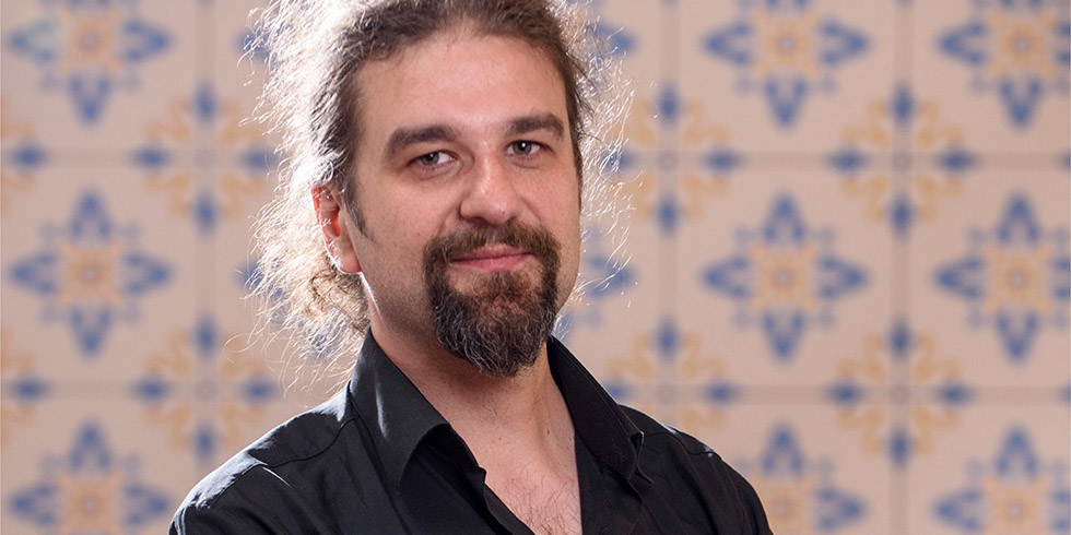
“Sublimating so much information, visual associations, psychology, technical knowledge and intuition within a single symbol is one of the most difficult tasks a designer can face. Of course, if he works by the rules.
I have always seen logo as a seed from which a world of tactile and untactile feelings specific to a certain company develops and grows. The logo is practically the only asset of a company that promotes 24 hours a day, 7 days a week. The logo makes a big difference between two companies involved in the same business. The entire visual identity is based on, or draws inspiration from, the logo in 99% of the cases. Of course, the logo itself without adequate visual identity cannot have such strength, and in some situations it could be completely misinterpreted.
A logo must be clear in communication, easy to implement, technically simple, memorable and timeless. This “timeless” part can be interpreted in many ways, but most of us will agree with the fact that some forms simply transcend eras and can never fall out of fashion. Geometry. Everything is based on geometry and whenever I have a design problem, I always turn to geometry as the primary source of all forms.
The lines inside the IBM logo, the simplicity of the Mercedes star, the rectangular shape of the National Geographic symbol all transcend the time in which they originated. They are equally relevant today as the day they were born. The geometric simplicity makes them such.”