


Drugi jezik na kojem je dostupan ovaj članak: Bosnian
By: Stana Šehalić
In the 55 years of its existence, UEPS has become a powerful brand with a distinctive logo that leaves a lasting mark on the collective memory of marketing. However, after you reach the age of 55, you sometimes seem old and obsolete to some because you have cherished the same image for so long, with its scent of good, but bygone times. The dynamism of life forces instant judgments based on first impressions, without examining the substantial, basic values of the experience and traditions that have accumulated in this Association, through all those who have maintained and preserved it with the power of their vision, despite temptations to do otherwise.
On the occasion of this anniversary, let’s take a little walk through history and recall the creation of the logo of the Association, and how it has changed through time. The designer of the first UEPS logo in the sixties was a painter from the Academy of Applied Arts, Mihajlo Pisanjuk, the second logo was designed by Rade Markičević from Design Center Politika, and the third and current visual identity was created in the mid-eighties by Edo Čehovin.
Yes, those are the characteristic letters, similar to the colors in the circles of the Olympic Games. It might just be associated with the well-known motto Citius, Fortius, Altius, as a permanent visual reminder of the fundamental commitment of the association, that it can always be Faster, Higher, Stronger.
That logo and the colors, have been on all publications and documents of the association, including the UEPS awards, which have also been improved and adapted to modern art trends several times, mainly on the occasion of some anniversary.

Following the thinking of the great marketing magician, Dragan Sakan, we decided to sprinkle a bit of gold dust on our diplomas and the subsequent event, for our own sake, but also because our members suggested that the look of the awards should be refreshed. So we asked a few creatives what the coveted award should look like. They were creative (how else could creatives be?), and offered their solutions, among which was the design chosen for this year’s awards.
The design of this year’s UEPS awards was created by Miloš Žarić, Art Director of New Moment agency, whose solution received the widest support. It’s a sophisticated, stylishly rendered solution that exudes sophistication and restraint, and that has wonderfully merged the values of the Association’s traditions with modern trends. More than ever before, the appearance of this year’s awards sends the message that they have the power of documents that never lose their value.
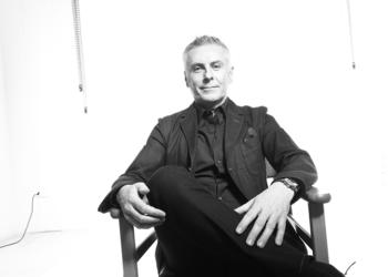
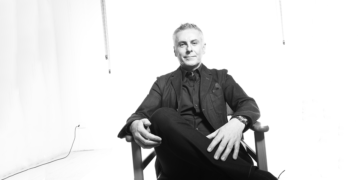
Miloš Žarić – creator of atypical ideas

Miloš is one of the most talented young creatives at the agency New Moment Beograd. He began his career in Paris, working for some of the largest global brands, such as the Paris Marriott, Double Tree Hilton, Pullman Hotel Paris, Longines, San Leon, Arjowiggins …, A young and gifted creator of atypical ideas, Miloš Žarić has a modest attitude towards his early success and believes that more success is yet to come, because he is confident in his driving passion for his chosen profession.