


Drugi jezik na kojem je dostupan ovaj članak: Bosnian
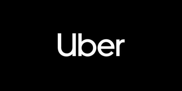
Uber is hard at work on remedying their image after a slew of issues they faced recently, and the latest rebrand might be seen as part of those efforts. Less than two years since the previous rebrand, the company has now doing yet another full rebrand of the business, unveiling a new logo that boasts a simple ‘Uber’, written in a custom typeface.
The new logo will replace the previous one everywhere the Uber icon currently appears, such as its Twitter account, website and mobile app.
Uber will also rebadge its Uber Eats division with the same lower-case look in the Uber Move font, championing the capitalised ‘U’.
Uber’s spokesperson commented the new rebrand for Mashable: “We’re excited to unveil a new, simplified logo for the Uber app that brings back the U, is easily recognizable, and is scalable across the 660 plus cities we serve.”
The redesign was facilitated by brand consultancy Wolff Olins, and the new typeface was designed by MCKL.