

Thirty cards linked to a single account, several apps to keep track of your own money, and payments that require entering the same information month after month. Banking has long since moved into our pockets, but that doesn’t mean everything about it has become simpler. Sometimes removing one unnecessary step is enough, while at other times, what looks like an ordinary account overview is actually one of the most demanding parts of developing an app.
These are precisely the kinds of problems Shape 404 and KentBank focused on while developing KentPro. More than 90 percent of users switched to the new app without visiting a bank branch, while the ability to view accounts from other banks in one place was the first feature of its kind on the Croatian market. The Best Digital Product award at MIXX Awards Croatia recognized a product in which much of the work becomes evident in how little work is left for the user.
We spoke with Vjekoslav Komušar, Project Management Team Leader at Shape 404, about the decisions that required the most convincing, the limits of creativity in banking apps, and what the team discovered only through real-world use.
How did you use the opportunity to build KentPro from the ground up to reconsider what users and banks already expect from mobile banking? What were you able to do differently from what is now considered standard?
The standard in mobile banking today is already fairly well defined by the set of features available. Users expect account overviews, payments, cards and savings, so it is difficult to introduce revolutionary features that do not already exist on the market. What takes an app to the next level is the user experience, or the journey we create for users to complete the actions they want to perform. Users repeat key actions very frequently, so we wanted each one to be as simple and effortless as possible: easily copying a previously completed payment order, turning an order into a template, completing a payment in just a few steps, and always having a clear understanding of what is happening with their orders, payments and account balances.
Two significant departures from the standard were PSD2 and the user migration process itself. PSD2 enabled users to see accounts they hold with other banks within the app, making it the first feature of its kind on our market. We offered migration from the old app to the new one entirely through a digital process. We could have sent users to a branch, which is the usual and much safer approach for us, but we deliberately chose a process users could complete themselves within the app. This was existing users’ first interaction with the new app, and it is precisely during those first steps that they form an opinion that influences how they will continue using it.
Despite numerous procedural and technical obstacles, we defined migration as a highly important feature from the very beginning and never gave up on it. The risk and effort ultimately paid off: more than 90% of users migrated to the new app entirely through digital channels.
Banking apps often look similar because users are already familiar with certain patterns. Where could you be creative, and where would originality have made the app more difficult to use?
Our guiding principle was not to reinvent what users need to do, but to give ourselves room for different solutions in areas where users can decide for themselves whether to use something.
Familiar patterns are essential wherever users perform everyday actions: entering payment orders, completing security steps, checking balances, accounts and transactions, co-signing payment orders, and retrieving statements and confirmations. These are non-negotiable elements that must be extremely easy to use and work flawlessly. Creativity has no place there because it would only slow users down in tasks they perform every day.
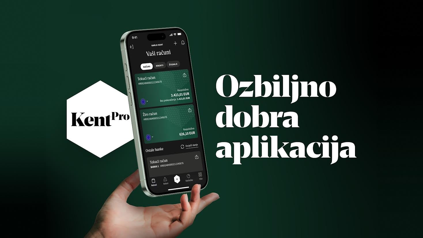
The home screen is a good example. We realized we couldn’t take an unconventional approach because users want a clear overview of all their accounts, so we didn’t experiment too much. Still, even within those boundaries, there is room for creativity and for creating something that offers additional value. We included an overview of accounts from other banks on that same screen and displayed account balances transparently, separating the total balance from the balance including the overdraft. It’s a small detail, but a very useful one for users, as this was a common pain point in other banks’ apps.
We had more freedom with supporting features. Users can rotate their device to hide amounts, drag accounts to change their order, and customize their own quick-access selection of features. These are details that don’t get in anyone’s way because users who don’t need them won’t even encounter them.
The goal of the first phase was to create an app that was reliable and simple, and then add just a touch of creativity through a few features. Now that we’ve ensured stability and user satisfaction, we’re looking ahead to features that will allow us to express more creativity.
The promise of a “Seriously Good App” could easily have remained just a marketing claim. How did you translate it into concrete decisions within the product itself?
We took that promise very seriously, first by thoroughly researching our target groups and then trying to meet the needs of each one.
Our primary group consists of SME users, who often have a larger number of accounts and cards. The second group consists of individual everyday users with one main account and possibly a loan or savings. These are significantly different usage patterns, and a “seriously good app” actually means making the experience easier for each type of user in a way that suits them specifically, rather than offering everyone the same average solution.
One concrete example of such a decision is that a user with a large number of cards sees them in a list and doesn’t have to swipe through thirty cards to find the one they’re looking for. They can also search through their accounts. A user with one account and one card doesn’t need that feature, so they don’t see it at all. The app adapts to the type of user rather than forcing users to adapt to it.
We then added another layer that allows users to customize the app even further, for example by personalizing the quick-access menu of features.
We applied similar logic to individual processes. When splitting a transaction into installments, some banks only offer users the option to select the number of installments, even though that isn’t their primary concern. They will choose the number of installments based entirely on the monthly amount they need to pay and how it fits into their monthly budget. That’s why we always put the information that is crucial to their decision first, making the process faster and easier.
Whenever we realized that users would start calculating something themselves, we did the calculation for them. For example, how much they spent on electricity last year. Ultimately, a “seriously good app” comes down to these details because they are what show users that their needs have been considered.
What did you have to learn about the behavior of banking app users that no initial brief could have revealed?
The initial brief was actually excellent. It defined the target groups based on the existing app, so we knew who we were designing for and which pain points we needed to address. That was our starting point.
Everything beyond that was up to the internal Shape and Kent teams. We frequently analyzed how to implement certain features in the app, and one major advantage was that the teams themselves used the app. In a sense, we could put ourselves in the position of users and design something we would also want to have.
During the research phase, we also realized that many pain points stemmed from the absence of small options within existing features. Users weren’t so much bothered by not being able to add a card to Apple Pay as they were by not being able to filter transactions by sender or simply send a payment confirmation. These are small additions, but they signal to users that we have considered their needs.
Still, user behavior can always surprise you. Some features we considered secondary turned out to be very important to users. The best example is Scan & Pay, which accounted for almost 60% of all transactions, even though our primary target group consists of SME users. That’s an insight no brief can give you in advance; you only discover it once the app is launched and people start using it. That’s why it’s important to implement appropriate analytics for every product to gain insight into actual usage, as this provides the basis for further improvements.
Was there a decision during the development of KentPro that you had to defend the most because its value couldn’t be demonstrated through a single screen or presentation, but only through actual use?
Connecting accounts from other banks through PSD2.
In a presentation, it looks like just another list of accounts, visually almost identical to what every banking app already has. In reality, it is a feature that requires a substantial development investment. It involves integration with other banks, managing consent and authorizations, and adapting to the fact that each bank exposes its interface differently. It is also a decision in which a bank consciously allows information about money held elsewhere into its own app.
It was precisely because of the complexity of implementation that this decision had to be defended. The value of connecting accounts isn’t visible in a presentation, but only once users link their accounts and start using the feature.
Only a deeper analysis reveals what this feature actually offers users. Their finances are no longer fragmented across several apps, as they can view the balances of all their accounts on a single screen. Before making a payment, they no longer need to open other apps to check their overall financial situation. This is particularly important for our primary users, who often maintain personal and business accounts with different banks. KentPro thus became the first banking app on the Croatian market where users can see all their accounts in one place, including those held with other banks.

