

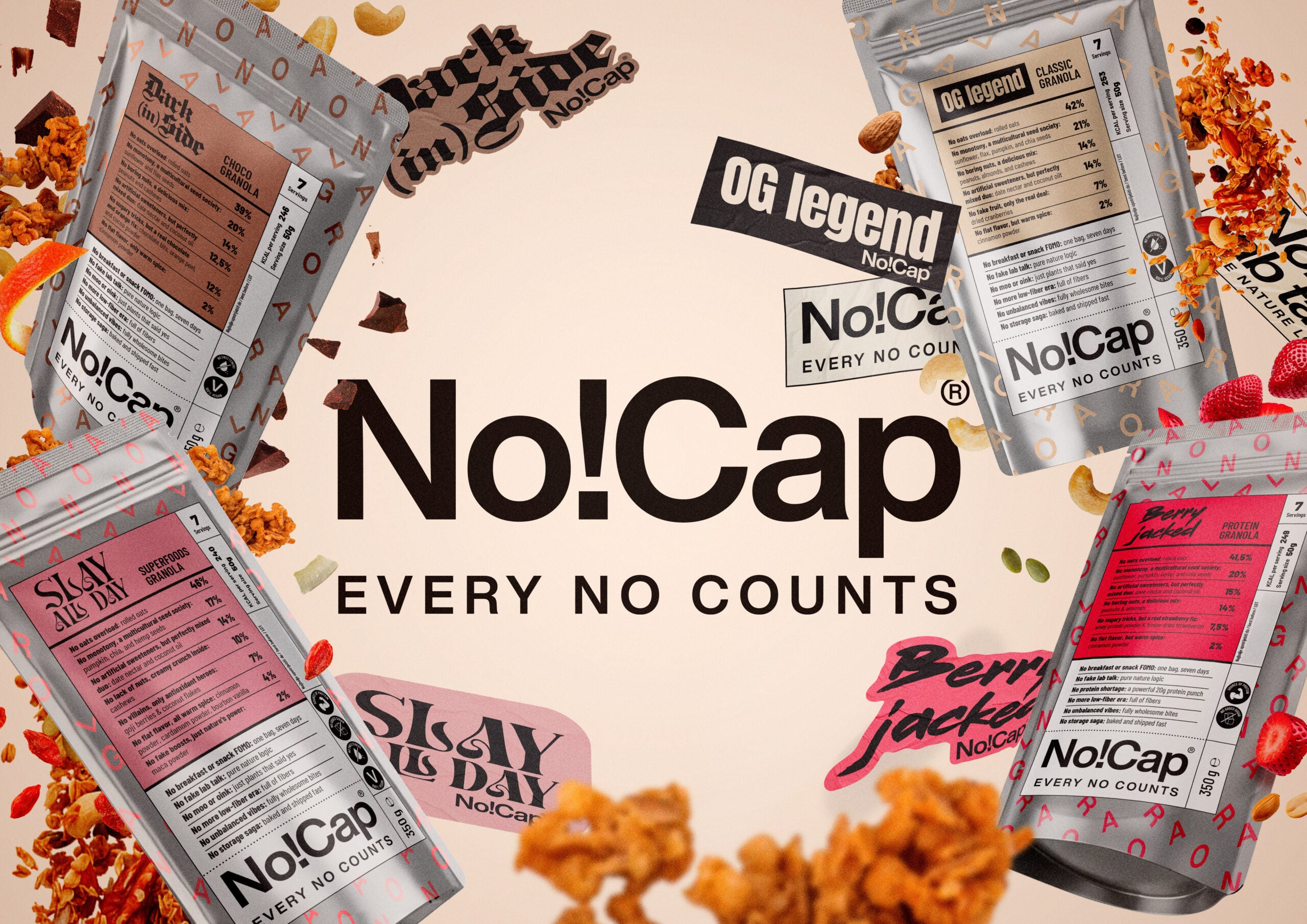
The most important information about a product is often given the least space on its packaging. Ingredients, nutritional values, and everything that actually tells consumers what they are buying usually end up on the back. The front is reserved for carefully chosen words, attractive illustrations, and promises of a healthier lifestyle. But what if that back label turned out to be more interesting than anything a designer could put on the front?
For Studio Sonda, the answer was convincing enough to build the entire identity of NO!CAP Granola around it. Instead of adding another layer of communication to the product, they decided to remove everything it did not need. The traditional front label gave way to the product declaration, and the word “no” became the most important word in the brand’s vocabulary. No to refined sugar, no to hidden ingredients, no to false promises. Behind a name borrowed from digital slang lies a simple belief: the truth needs no embellishment.
Interestingly, Sonda arrived at an identity that makes no effort to be louder than its competitors, despite being created for one of the categories where the battle for consumer attention never stops. The packaging became both the message and the medium, and this approach to design earned the project two Gold awards at BalCannes, in the Best Branding and Best High-Volume Packaging Design categories. Beyond the award-winning solution lies a much broader question about how willing brands are to reveal what they usually leave in the fine print.
In the latest interview from our Behind the Winning Idea series, we speak with Jelena Fiškuš and Sean Poropat of Studio Sonda about the boundary between design and marketing, why removing something can sometimes be the hardest part, and how an entire brand can be built around one decisive “no.”

The healthy food category is full of big promises. Why did you decide that the new brand should begin with the word “no”?
When we look at the healthy food shelves, we see that they are overflowing with big, sometimes empty promises. Everyone is shouting “YES” to everything: yes to health, yes to nature, yes to energy… But when we turn the box around and read the fine print on the back, we realize that this “yes” often comes with many hidden compromises.
That’s when we realized that, in a world so full of embellishment, drawing a clear line is actually the most radical and honest thing we can do. We decided to use the word “NO” because it is uncompromising. But in reality, every “no” on our packaging (no to refined sugar, no to hidden ingredients, no to false promises) is one huge, powerful “YES” to premium quality, natural ingredients, and, above all, respect for the person putting that food into their body.
Studio Sonda often finds a product’s identity in what the product already is. What did you first have to strip away from NO!CAP to get to its essence?
Thank you for that observation, because it truly captures the very essence of our philosophy and the way we work. At Sonda, we always try to strip things down, removing everything unnecessary to the greatest extent possible, so that we can reach the core, the true, essential value of a product or service. People often think of design as a process of adding elements and “dressing things up,” when in fact it is exactly the opposite. We want to subtract, simplify, and leave only what is absolutely necessary.
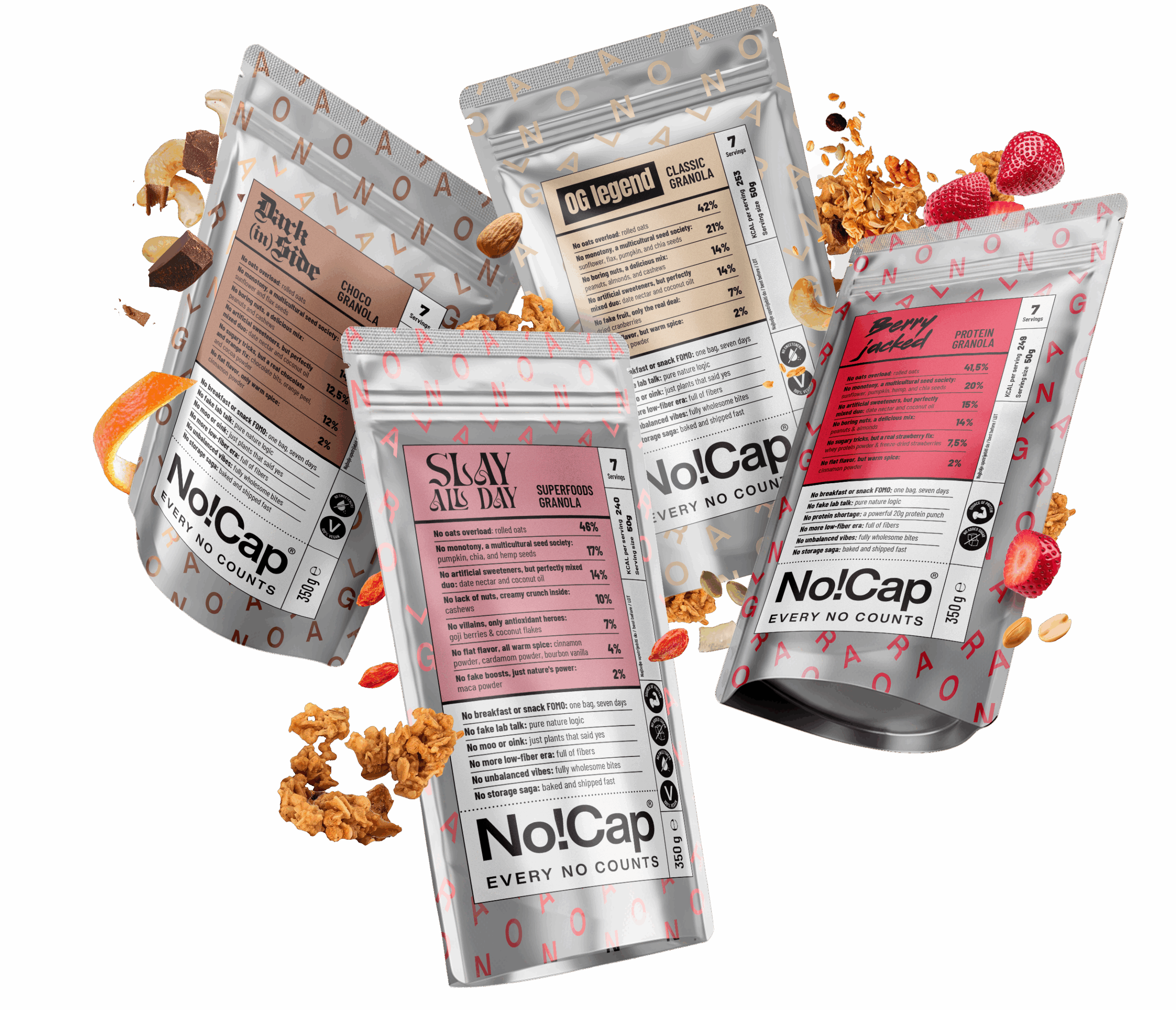
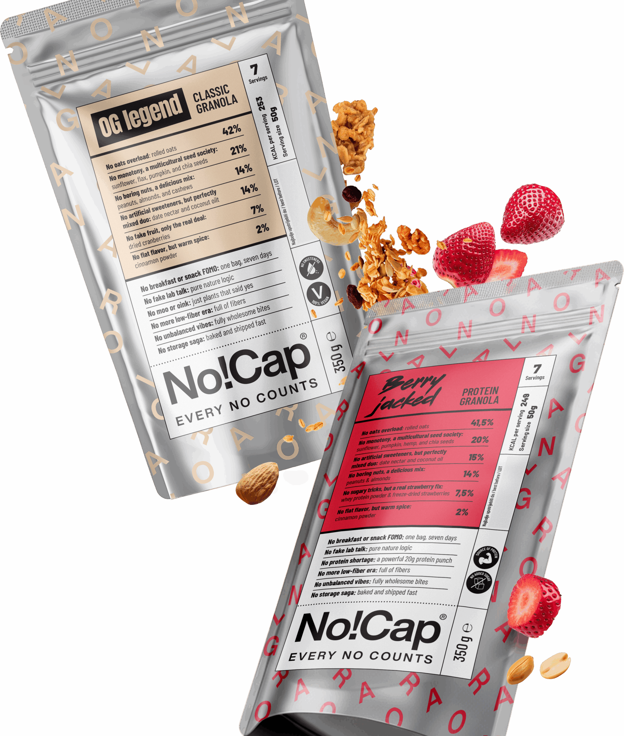
In the case of NO!CAP, we went so far as to eventually remove the traditional “front” label itself. What the industry usually puts at the forefront are beautiful illustrations, little green leaves, natural paper, or, even worse, imitations of it, while the real truth is often hidden on the back, printed in the smallest possible letters. We reversed that. The ingredients in this granola are of such uncompromising quality that the only logical choice was to put them front and center. So the so-called back label, containing precise information about the product’s contents, was moved to the front of the packaging.
How do you turn an expression from digital culture into an identity that won’t become outdated along with the slang it originated from?
Slang is temporary by nature; it reflects a specific moment in time. But the value behind the expression “no cap,” which in slang means “the truth, no lies, no exaggeration,” is universal and timeless. We didn’t build this product’s identity around an internet trend. Instead, we used it as a starting point for a deeper story about transparency, turning it into a long-term reflection of the brand’s philosophy. The name may have originated in today’s digital culture, but the attitude it represents will never become outdated.
In this project, packaging is not just a carrier of the identity but the main place where the brand communicates its values. Has the packaging essentially become the campaign?
Absolutely. In the fast-moving consumer goods industry, packaging is your first, and very often your only, communication medium, so it makes perfect sense to use it to promote the product. For NO!CAP, we therefore made a decision: we took what many hide on the back, turned it around, and made it the main visual element. If a product is genuinely clean, there is nothing to hide. Packaging stops being merely a product’s “wrapper” and becomes the brand’s manifesto.
From the very beginning, it became our main campaign, because every time a consumer picks up that bag, they are not reading a traditional marketing message, but the truth about the product.
Can honesty be a strong enough idea on a shelf where everyone is competing to be louder than the competition?
We are convinced that honesty is the loudest possible strategy today. Every product or service has its own value, its own truth, and it is important for communication to reflect the reality of what it represents. People are tired of having to play detective and decipher product labels while shopping for breakfast, or anything else, for that matter.
With NO!CAP Granola, we were fortunate to have a product that allowed us to create something that communicates calmly, clearly, and with complete transparency amid all the noise of today’s world, actually “cutting through” that noise precisely through its silence and confidence. Honesty in design is not just a “nice gesture”; today, it is the most powerful tool for building trust. And it has been proven time and again that trust is the only currency that lasts in the long term and connects people to a product, making it an exceptionally intelligent business decision.

