


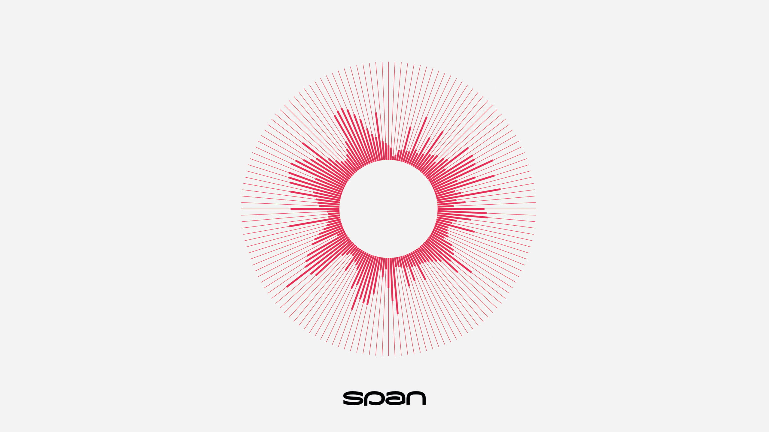
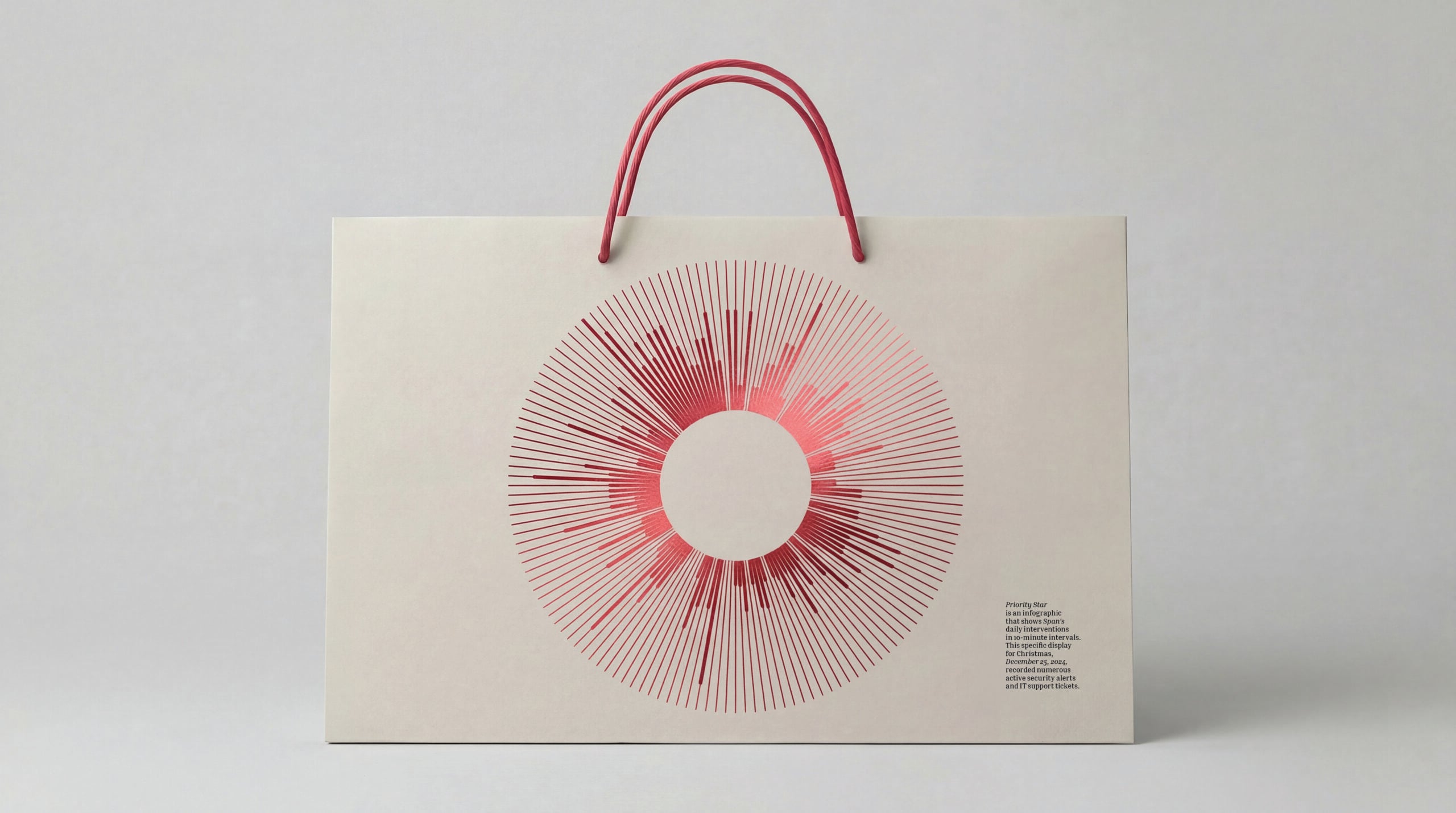
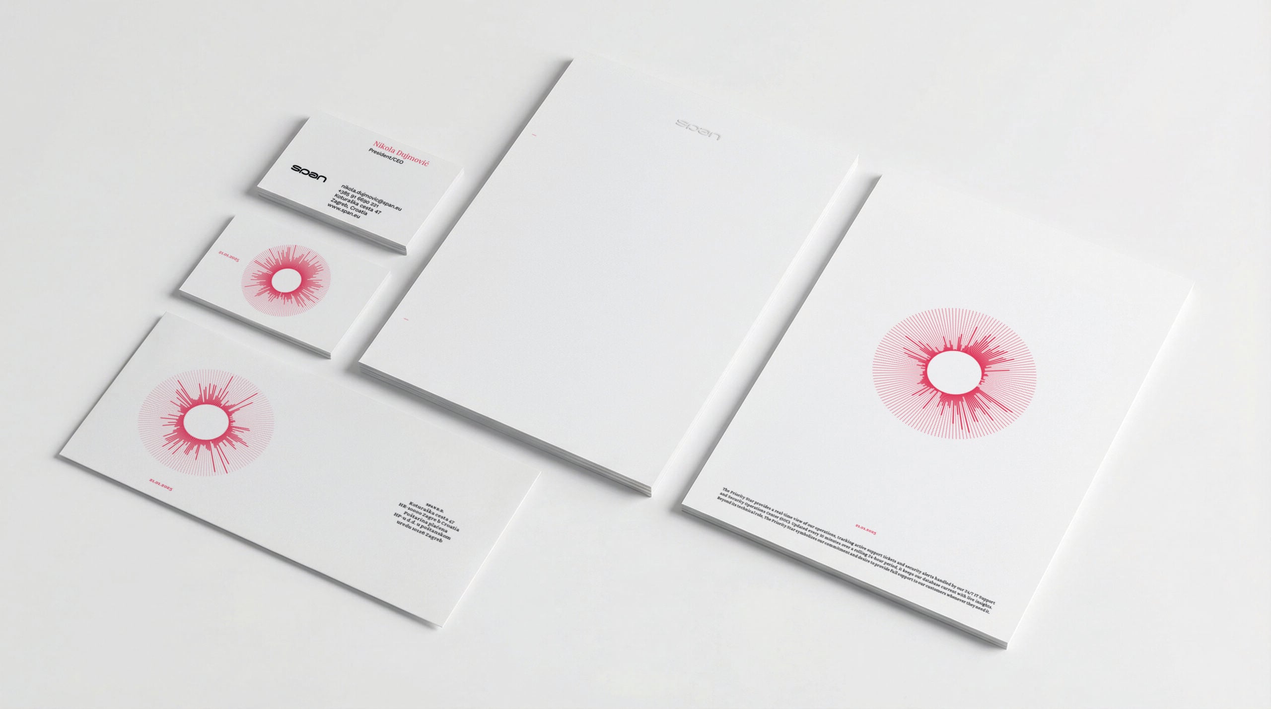
The circle has 144 segments, one for every ten minutes of the day. Their thickness depends on the intensity of the data coming from Span’s security operations centre and IT support. This is Priority Star: a visual element whose shape is derived from the work the company performs around the clock. Behind it are security alerts, customer requests and the teams handling them, with data on their work refreshed every ten minutes.
Agency Bruketa& found in this operational data a way to demonstrate the value of Span’s work, which often remains invisible to clients while their businesses run smoothly 24/7. In the rebranding project titled The Identity That Never Sleeps, data on this work became the basis for the appearance of Priority Star, the central element of the company’s new visual identity.
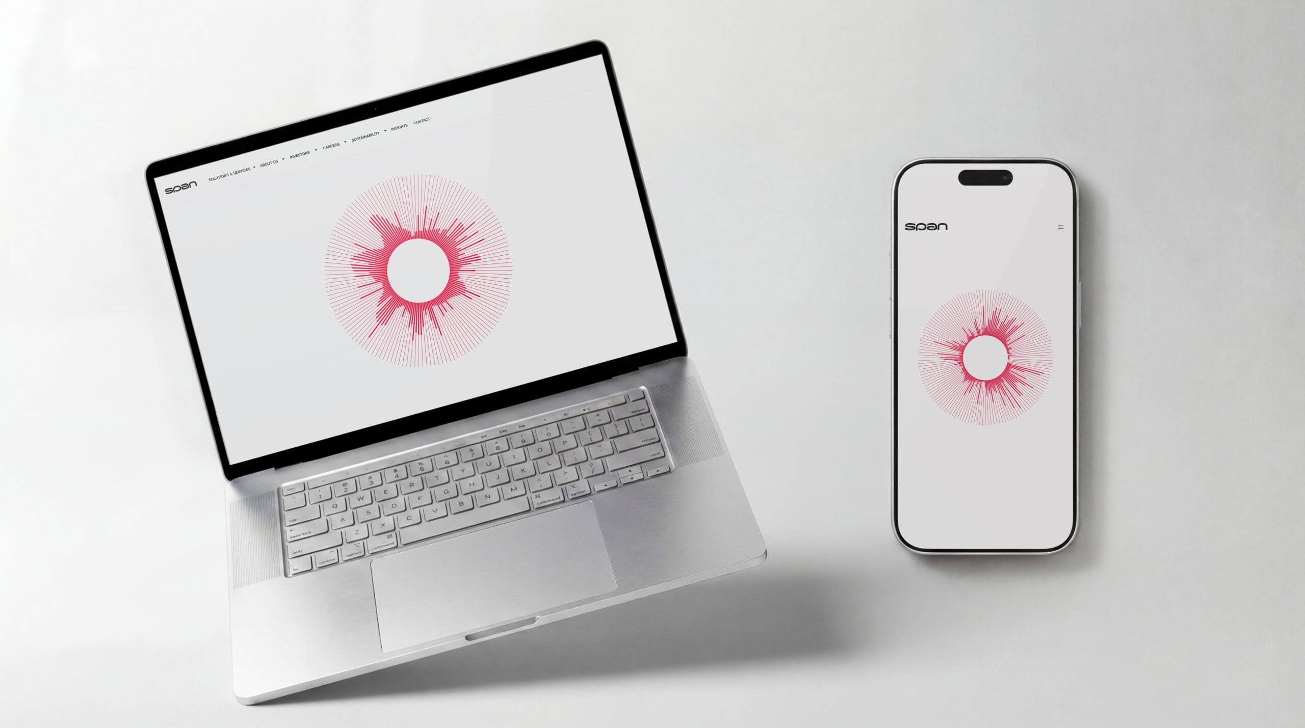
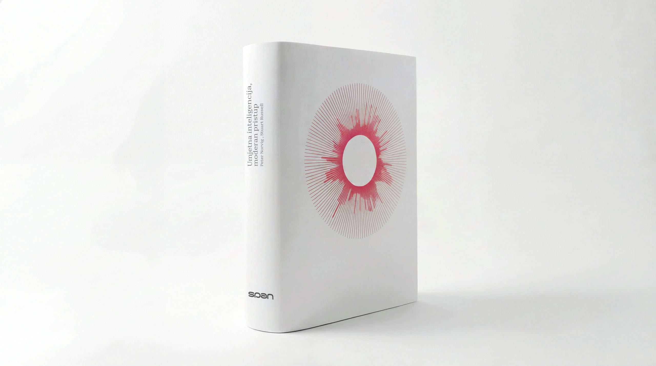
This element can be seen on the corporate website and intranet, where it tracks the daily rhythm of Span’s operations live, serving as a kind of company pulse. The interactive element also generates static visuals for documents, proposals and business cards, which either carry the date on which the Priority Star was created or are its visual derivatives. Each of these examples retains a connection to the work of a company that, because of the nature of its business and its work for clients around the world, never sleeps and is always there when support, protection or help is needed.
A Good Day Without an Incident Is Hard to Show
The value of a top-quality B2B IT service is often recognised through the absence of problems. An incident is prevented, a problem is resolved, support is available, and business runs smoothly. For the client, this outcome is crucial, but the company making it possible faces a communication challenge: making the work behind it visible.
Span, a leading Croatian IT company with more than 30 years of experience, initiated the rebranding in response to market needs and its ambitions for further growth and internationalisation. The new brand strategy, visual identity and communication strategy were intended to support this development, demonstrate the company’s readiness to adapt to contemporary challenges and strengthen its market position.
The positioning was defined through the role of a “multi-specialist” in three strategic areas: Cloud, cybersecurity and artificial intelligence. Differentiation rested on a combination of technical excellence and authentic customer care. Alongside expertise, the company also needed to communicate its understanding of clients’ business challenges, their expectations and the people who use technological solutions.
The IT market is characterised by accelerating digital transformation and the growing importance of trust, security and speed of implementation. Clients expect partners to integrate innovation, provide proactive support and be transparent, while workshops with management identified three dominant needs: reliable solutions that can withstand future challenges, rapid response and adaptation, and competitiveness through relevant, advanced and cost-effective solutions.
Promises alone were not enough. Clients needed to be able to see the value Span provides, including the work that goes on continuously, even though its results often attract little attention.
Data Was Given a Design Task
The strategic decision was to take a product-led approach and develop a digital product as part of the visual identity. Priority Star was conceived as a platform that gives users insight into Span’s operations. Continuous support and cybersecurity were given a measurable visual representation, available to clients at any time.
The product’s backend consists of an API connected to Span’s Security Operations Centre and IT support, which operate 24 hours a day. The frontend transforms the collected data into a data visualisation interface designed to provide a quick overview of information. Security alerts and support requests become part of a 24-hour view of operations, revealing the company’s constant presence and operational agility.
The design challenge was to make complex technical metrics easy to follow while building a distinctive visual expression. The project’s creativity developed through the product concept and the way data becomes an intuitive, aesthetically compelling interface.
Different uses were built into the product itself. Priority Star was developed for multiple platforms, as a dynamic web component, a desktop screensaver for employees and a generator of static visuals for offline materials. A single system thus connects an overview of operational work with the appearance of everyday business communication.
The name The Identity That Never Sleeps precisely describes how it works. Security operations and support run continuously, and the identity responds to the data this work produces. Its appearance is tied to Span’s specific activities, which means it cannot simply be transferred to another brand.
“We get IT!” Began with Conversations Within the Company
The development of the identity was preceded by close collaboration between the agency, Span’s internal team, the Management Board and people from different parts of the company. Strategic workshops were used to define the current position, the direction of development and the characteristics that distinguish Span in the market.
Employees brought an understanding of the company’s strengths and weaknesses gained through their daily work. These different perspectives needed to be brought together into a clear brand strategy from which the new identity would emerge. This way of working made it easier to embrace: people could recognise their own company in the new solution and understand the reasons behind its creation.
The brand promise was distilled into the slogan We get IT!, also presented within the system as | we get IT |. The message speaks to technological expertise, but also to an understanding of the client, their business challenges and the people behind the technology. It brings together Span’s ability to understand the challenges of the modern digital age and respond to them quickly and reliably.
The brand architecture was built on three value pillars. Ahead of the Times refers to the continuous exploration of innovation and anticipation of trends to improve customers’ IT assets. Care encompasses commitment to customers, suppliers, employees, partners and society, expressed through expertise, responsibility and a sense of duty. Honesty and Transparency means open, clear and consistent communication that builds long-term trust.
The attributes of expertise, competence, adaptability and humanity were derived from these values. The brand manifesto emphasises partnership, integrity and proactivity, positioning Span as a partner that enables stable business operations without compromising between security, speed and competitiveness.
Internal communication included educating employees about the new brand architecture and communication standards. Priority Star also gained a role in internal systems, where it gives employees insight into their own contribution. An identity that displays the company’s work thus became available to the people whose activities shape its appearance.
The Same Span on the Website and in a Proposal
The new logo, modernised typography and colour palette were combined with Priority Star in a system that expresses technological sophistication and openness. Clearly defined elements ensured recognisability, while flexibility was needed for application across different services, markets, audiences and formats.
Not every format had to look identical. Shared visual and verbal standards were intended to ensure that Span would be recognisable in every execution, whether on a website, in a social media post, a presentation, sales materials or internal communication.
The communication strategy covered the consistent application of these standards, differentiation through specialist expertise and the human factor, increased recognition of Span as a leader in Cloud, cybersecurity and artificial intelligence, and the building of trust through transparent, honest and educational communication.
Messages were organised into three levels. Top-line messages address users’ underlying tensions, sub-line messages highlight experience and expertise, while detailed supporting arguments include technical specifications, examples of good practice, case studies and reasons to believe. This structure allows the initial message to be developed further through concrete information about services and their value.
External communication covered the website, social media, PR, B2B presentations, industry events and white papers. The new identity was applied across all materials, while Priority Star was implemented on the corporate website and in internal systems. The visuals it generates are also used on documents, proposals and business cards.
Full implementation made Priority Star a standard across all the company’s digital platforms. On the corporate website, it serves as “proof of work”; in internal systems, it gives employees insight into their own contribution; and through offline materials, it also accompanies business communication beyond the screen. It has become an integral part of internal and external conversations about the value Span provides.
Its success is reflected in this integration: the product has grown beyond an individual application to become the company’s shared visual language. An abstract service has acquired a tangible digital form used in everyday business operations.
The project The Identity That Never Sleeps won gold at IdejaX in the Rebranding category. The business rationale for the change, positioning, technology and design were connected through a product that both expresses the identity and provides insight into the company’s work. The same data that shapes the circle on the website determines the appearance of the visual on a business proposal. The connection between what Span does and how it presents itself is built into the system.
The Team Behind the Project
Bruketa&
Creative Director: Davor Bruketa
Project Director: Roberta Kranjec
Brand Strategy: Karlo Stojčević
Art Directors: Petar Popović (Lead Designer), Davor Bruketa, Ivana Momčilović, Andrea Knapić
UX/UI: David Asael
Project Manager: Karla Šalić
Senior PR Specialist: Davor Ćosić
Span
Brand and Communications Director: Iva Repač
Marketing Communications Manager: Andrea Blažičević
Digital Production Team Leader: Ivan Granić
Senior Marketing Specialist: Borna Šimić
Coordinator: Nikolina Vidović

