

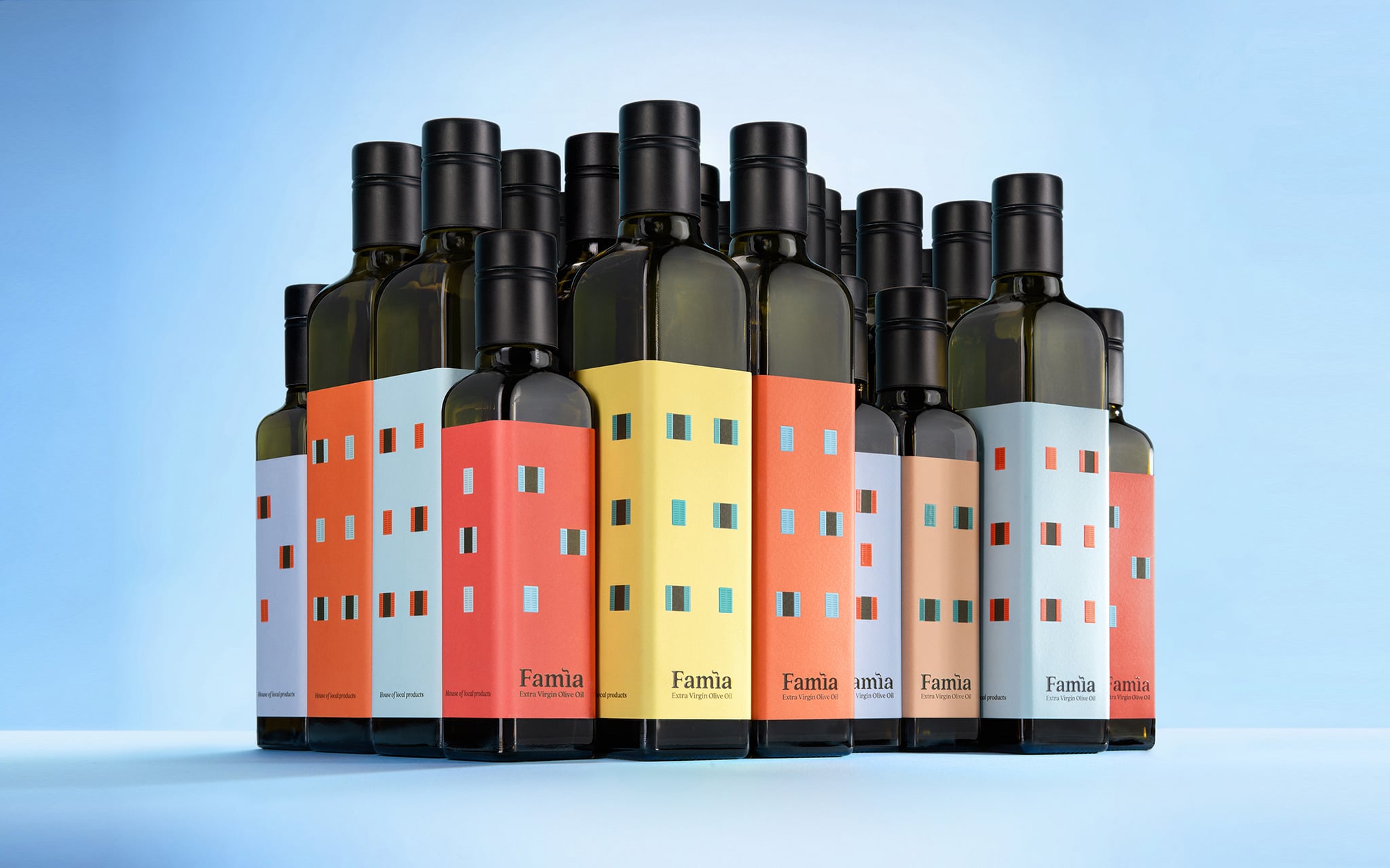
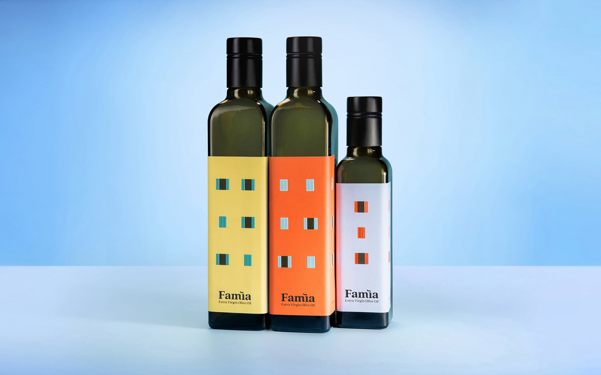
A bottle of olive oil stands on a shelf. It is square, coloured like a façade, with windows and a small chimney. Another is placed beside it, then a third. Several separate products begin to resemble the closely packed houses of Rovinj’s old town.
Behind the visual play of Famìa – House of Local Products lies a precise response to the needs of a small local brand: build a recognisable identity, distinguish its products, attract customers’ attention and stand out on the shelf without a major investment in retail space.
The project won the Grand Prix at IdejaX 2026, along with gold awards in the Food and Best Packaging – Small Batch categories. The path to those awards did not begin with a desire to make an unusual label. It began with the question of how to find a place for its own product among dozens of other local products and give it a value that would not disappear once the bottle was empty.
Building a brand among 80 producers
House of Local Products is a shop in Rovinj catering to domestic and international tourists, with Croatian products from approximately 80 producers. The owners wanted to offer their own line alongside them, starting with olive oil.
The task was not limited to packaging. The new product needed a brand of its own, recognisable enough to stand out among local, artisanal and tourist products, but flexible enough to encompass a broader range one day.
The starting point already included three different names. Vero naše d.o.o. was the registered company name, Mylando the product name, and House of Local Products the shop name. Adding another name without a clearly defined role could have made communication even more complicated.
Studio Tumpić/Prenc faced two connected problems. The new brand needed an identity of its own, independent of the existing names yet firmly tied to the shop and the place it came from. The packaging also needed to do some of the work of the retail space. For a small brand, dedicated displays, set design and larger changes to the point of sale would have meant additional costs.
In other words, the product was expected to attract customers on its own.
The story was in the house, not the olive grove
Olive oil is most often presented through familiar Mediterranean motifs: the olive tree, branch, fruit and landscape. This visual language clearly identifies the category, but it is less effective at building an identity that belongs to one specific place.
The creative team turned its search towards Rovinj itself. Because Studio Tumpić/Prenc is based in the city, the research did not stop at photographs and general references. Team members returned to the same locations, recorded details and studied the colours of façades, windows, chimneys, differences in the heights of houses and the way they come together to form the city’s recognisable silhouette.
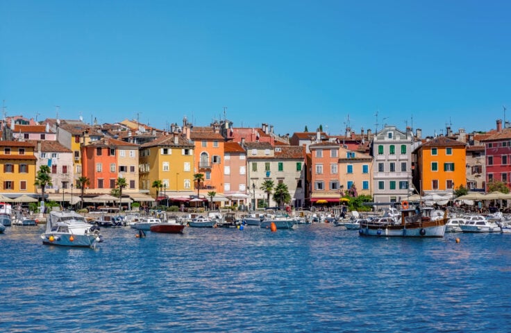
They found the most important clue not only in the architecture, but also in the former everyday life of Rovinj’s families.
In the ground floors and cellars of their homes, families kept their own supplies of olive oil, produced from olives grown in groves outside the town centre. The many oil mills that once stood at different locations around the city, and no longer exist today, also testified to the importance of olive growing in Rovinj.
Olive oil was as much a part of the house as it was of the landscape it came from. It belonged in the kitchen, at the shared table and in family life, woven into the rhythm of everyday living long before it became a product on a shelf.
The name Famìa, meaning “family” in Istriot, condensed that insight into a single word. It gave the brand a local foundation without relying on tourist clichés, and gave the creative team a basis for developing the other elements of its identity.
From one house to an entire town
The first idea was to depict a single bottle as a Rovinj house. The packaging’s existing square shape already resembled a small building, so the label did not need to conceal or change the product’s form. It could use it.
Further development revealed a broader possibility. If each bottle represented one house, arranging them together could create an entire townscape.
A house is a home, a place where families gather and where food is prepared and shared. The motif connected the meaning of Famìa naturally with olive oil, without needing a series of additional symbols to explain the product’s origins.
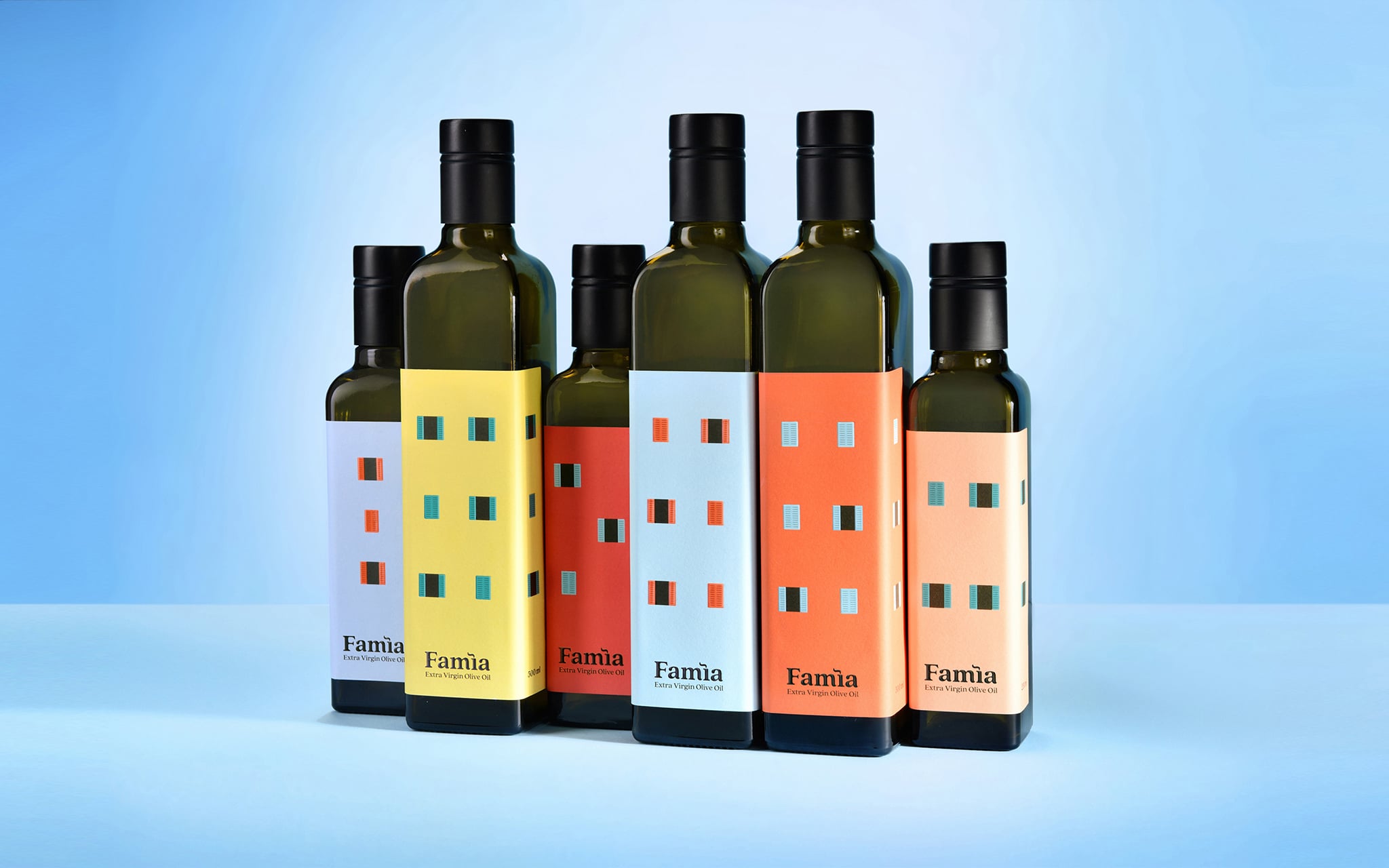
Each bottle had to work on its own. Customers can see what the product is and how intense it is, while its appearance conveys the story of the place it comes from. Different bottle sizes become houses of different heights, and their colours and windows create a rhythm reminiscent of Rovinj’s old town when placed together.
Among Rovinj’s once recognisable features were its many chimneys. Many have since disappeared, but the chimney took on a new role in Famìa’s identity.
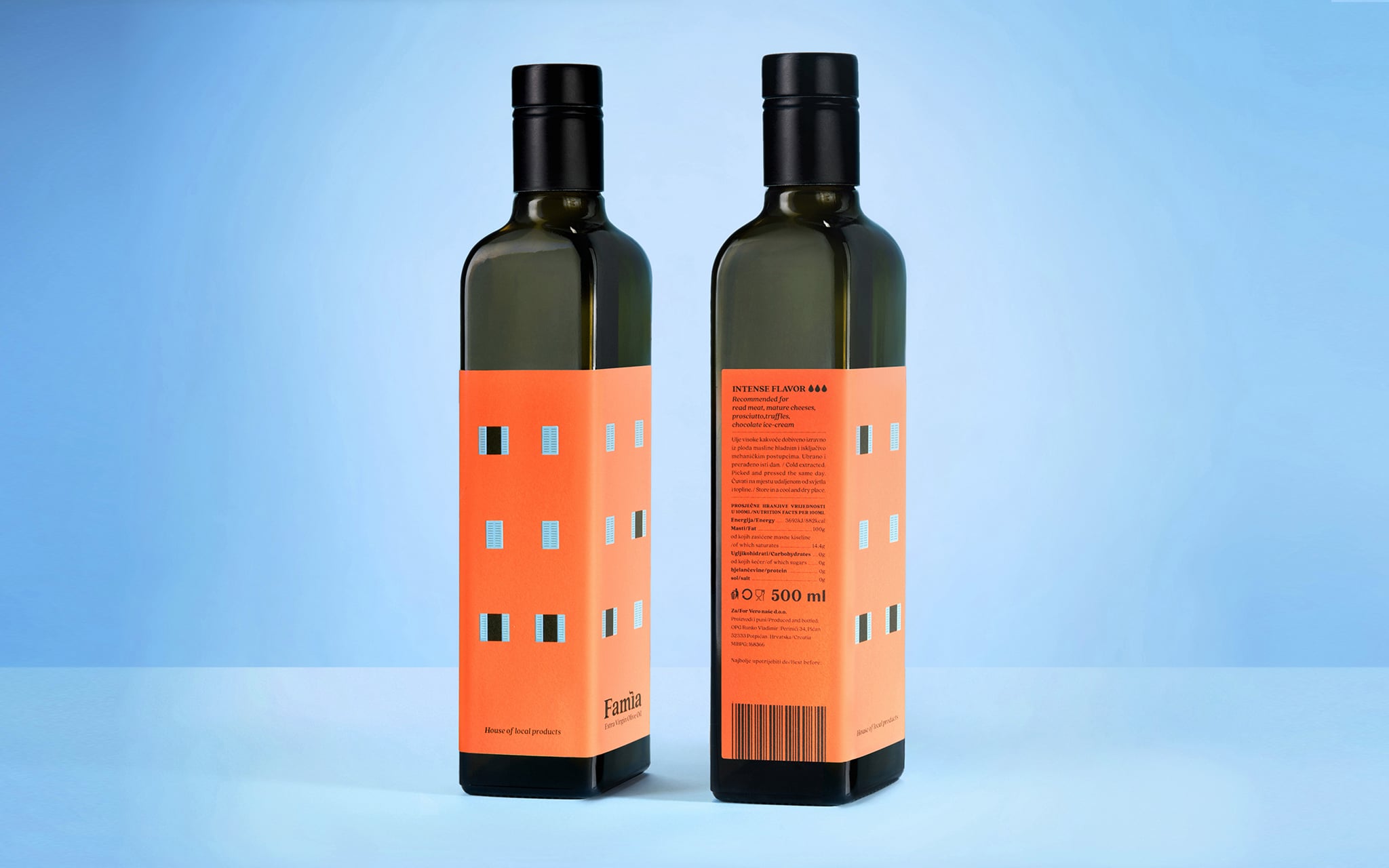
The mark above the letter “i” is shaped like smoke rising from a house. On the label, it sits where a chimney would stand on a Rovinj house, connecting the logo with the bottle’s architecture. The smoke evokes life inside the house, the kitchen and a family gathered around food.
The shop name House of Local Products became a slogan. What might previously have seemed like one more name in a complicated brand structure became a natural extension of the concept.
Rovinj translated into a label system
Turning the town into packaging did not end with illustrations of a few houses. Every element needed a role across the entire product line.
The colours were chosen from actual Rovinj façades, whose variety was carried onto the labels. They also took on the practical function of distinguishing the oils. Stronger, more saturated tones represent more intense oils, while softer and lighter colours are used for milder varieties.
The intensity is also marked on the back of the packaging. One drop indicates the mildest oil, and three drops the strongest. Customers do not have to rely solely on the product name or know the entire range to make a choice.
The character of the façades was also reflected in the choice of materials. The paper’s matte surface represents the façade, while the windows have a glossy finish. The contrast sets them apart from the background and gives the label an additional visual and tactile dimension.
Some windows are open, others closed. These differences bring a sense of everyday life and prevent the town from looking like a repeated graphic pattern. Each bottle has its own character while remaining part of the same whole.
The labels had to be different enough to clearly communicate the individual intensities and bottle sizes, yet connected enough to create a unified townscape on the shelf. The small differences between the houses needed to remain visible and consistent across the entire line.
Marina Klanjac Grubić of the Etikgraf printing company took part in production, while the project photographs were taken by Đani Celija of Alcor Visual d.o.o.
The shelf as a small town scene
From the outset, the client wanted a product that would stand out without additional branding in the retail space. The solution was found in the packaging itself. Placed side by side, the bottles form a town scene and stand apart from products displayed in a conventional way.
The composition is not fixed. Changing the order of colours, sizes and types of oil creates a slightly different townscape each time. The little houses can be arranged like Lego bricks, so the line remains recognisable even as its layout changes.
The system also has collectible potential. Customers can combine different houses, colours and intensities to assemble their own miniature Rovinj. Each product makes sense on its own, while the view of the entire line creates a reason to choose more than one bottle.
The packaging can remain in the home after the oil is used. The bottle can be reused to store another product or kept as a decorative object. For a product also intended for tourists, this continued life has particular value. Instead of a label that merely depicts a city motif, customers receive an object that recalls one of its houses.
Value they did not have to explain further
Reactions after the launch showed that the bottles attract the attention of domestic and international visitors. Customers notice them, comment on them and linger by the shelf because of the visual concept. Praise from both groups of visitors confirmed that the identity is locally recognisable while remaining understandable to a wider audience.
There were enquiries about buying Famìa as a corporate gift, and the City of Rovinj-Rovigno also showed interest. The olive oil moved beyond the role of an everyday food product and gained value as a representative local gift.
The commercial contribution of the design can be seen in the product’s expanded meaning. Famìa does not compete in the market solely through what is inside the bottle. Origin, identity and experience have become part of the value customers recognise before they even taste the oil.
The system also leaves room for new local products. Jams, spices and honey can become new houses within the same brand, extending the visual and conceptual logic of the first line.
Simplicity that held through every layer of the project
With Famìa, one idea quietly holds the entire system together. The brand’s name and origins, the way the product line is distinguished and organised, the logic of choosing on the shelf, and even the way the bottles appear together in the space all grow from it. Everything feels part of the same story, without each new element needing a separate explanation or reinvention. That is why the identity has enough room to grow without losing what made it recognisable from the start.
Anselmo Tumpić, the project’s creative and art director, observed a return to a simple, analogue and spontaneous creative approach, without the need for special effects. Famìa belongs to that understanding of creativity.
Its simplicity, however, did not come from taking a shortcut. Behind a bottle that looks like a house are research into local history, observation of architecture, decisions about brand architecture, the choice of name, development of the colour system, coordination of different bottle sizes, selection of paper and finishes, and consideration of how the product would live on the shelf and after purchase.
Famìa does not wait for an additional campaign to explain the brand. Its story already lives on the bottle, beginning with a scene that was once part of everyday life in Rovinj: a family home where a household kept its own supply of olive oil.
Project team
Client and brand co-owner: Petra Runko
Creative and art director: Anselmo Tumpić, Studio Tumpić/Prenc
Designer: Andrea Rosar, Studio Tumpić/Prenc
Account director: Sara Prenc Opačić, Studio Tumpić/Prenc
Copywriter: Aleta Brattoni, Studio Tumpić/Prenc
Production: Marina Klanjac Grubić, Etikgraf
Photography: Đani Celija, Alcor Visual d.o.o.

