

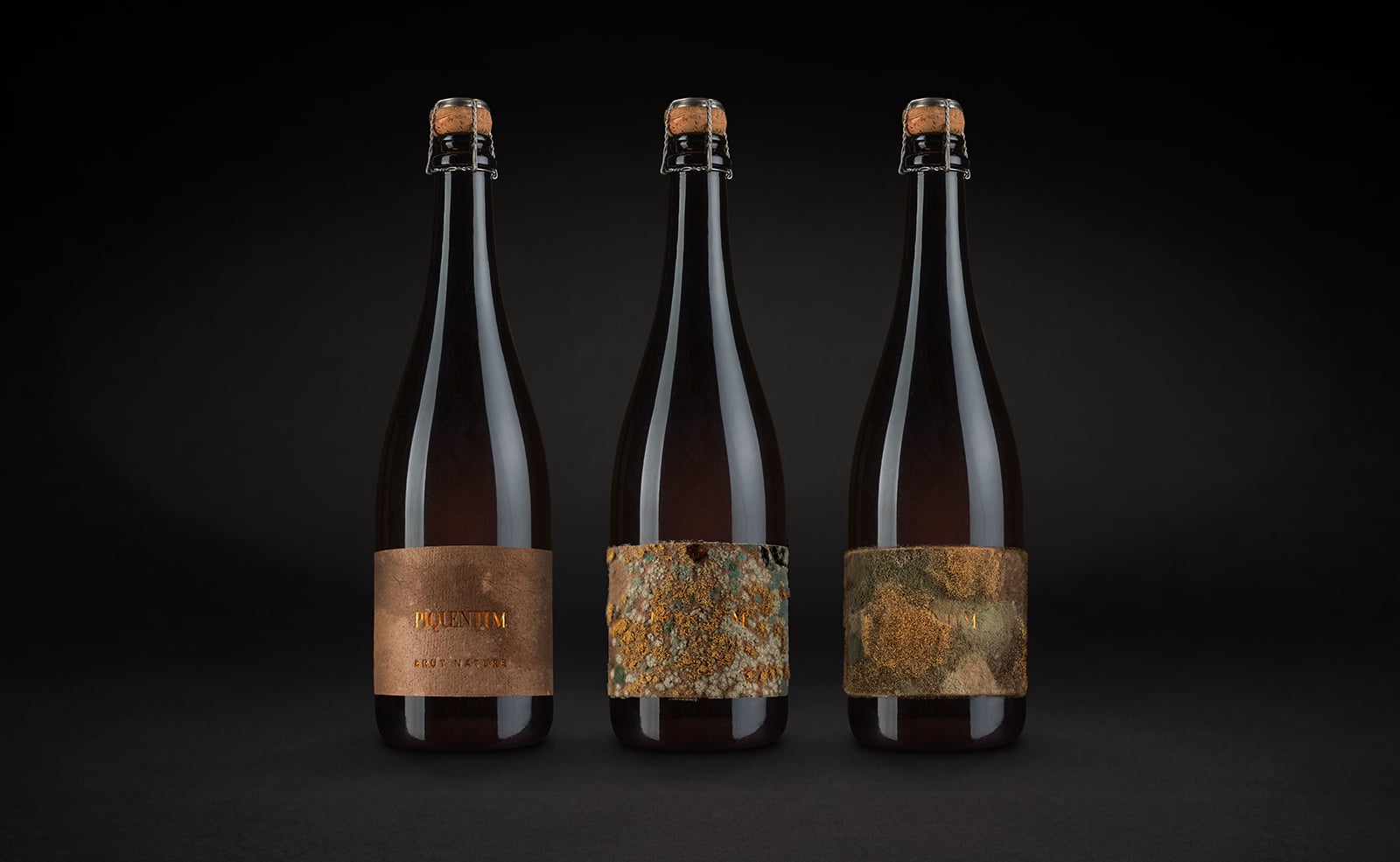
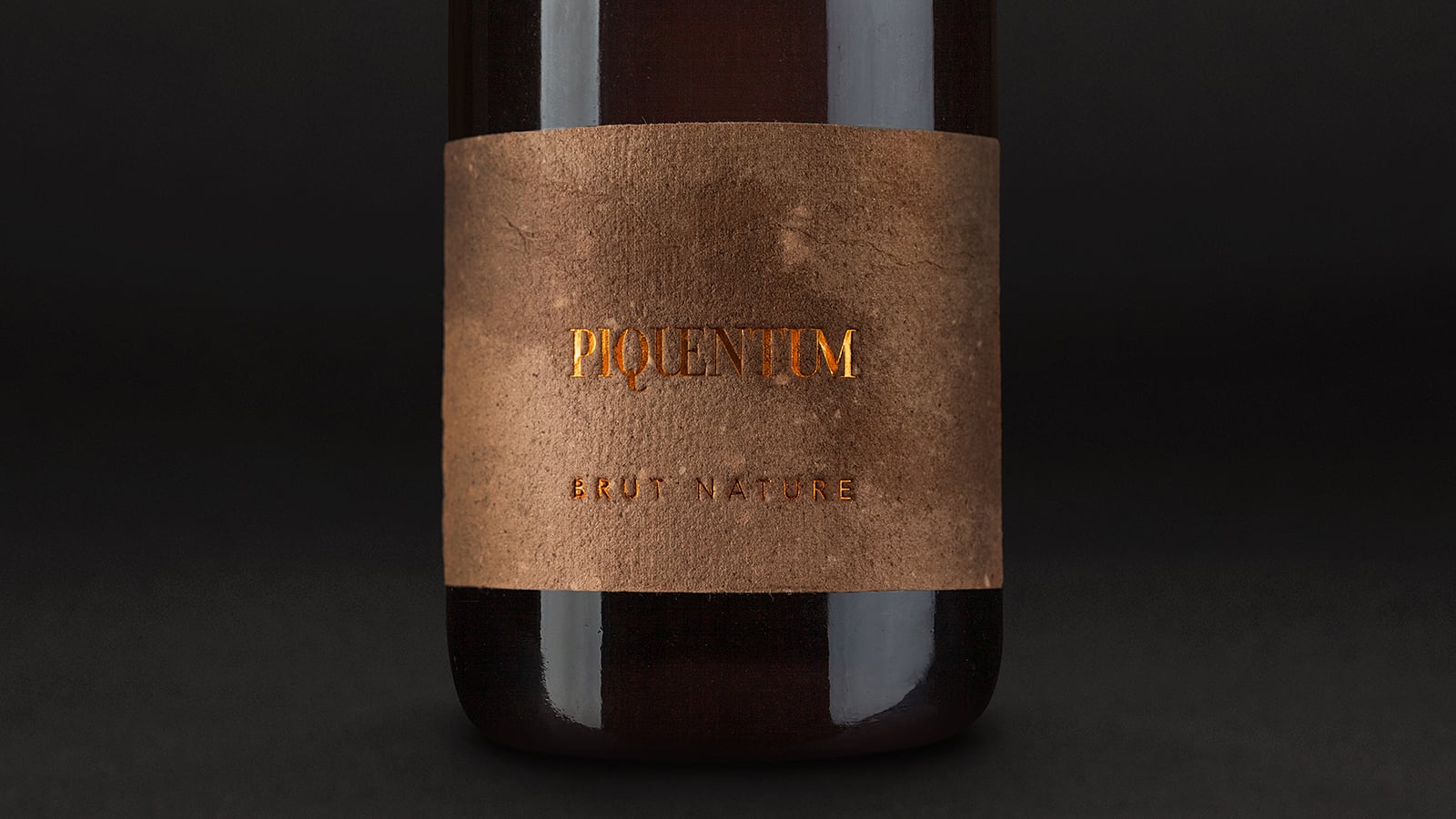
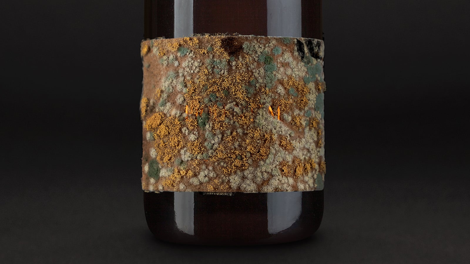
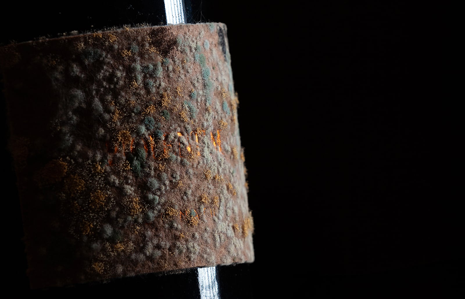
Premium design usually relies on precision, control and as few surprises as possible. With Piquentum Brut Nature, one of the most important decisions was precisely the opposite: recognizing the moment when the designer should stop and allow the product to continue the work. The sediment that forms during wine production, something that would usually be removed, became the material of a label that changes, develops and ages together with the wine. Nature did not serve merely as inspiration for the design here, but was given a real role in its creation.
That is perhaps why this is the most fitting project with which to open the Behind the Winning Idea series. Giving the wine part of the authorship meant accepting that the designer does not have to control every detail and that unpredictability itself can create what makes the product different. With this approach, Piquentum Brut Nature won four gold awards at IdejaX and BalCannes, but more important than the awards themselves is the idea on which the project was built: respect for nature, the process of creating wine and the person who makes it.
Behind the project is Studio Sonda, which has spent more than two decades building a distinctive creative approach to design and communications and has received more than 200 professional awards. Their ideas rarely begin with form alone. They grow out of the product, its origin, people, materials and context, so what ultimately looks different usually has a very concrete reason for being that way.
For the first conversation in the series, we spoke with Jelena Fiškuš and Sean Poropat, creative directors and co-owners of Studio Sonda, about what happens when a designer consciously gives up part of the control, how much space should be left to a natural process and why sometimes the willingness not to know every detail in advance is precisely what takes an idea further.
Premium design in the wine industry is often built on precision, control and an impeccably polished appearance. What led you to choose, at first glance, the complete opposite direction for Piquentum?
The fact that today we no longer find true “premium” in perfection, but in authenticity. We decided to go in that direction simply because we wanted the design to tell the truth about the product itself. Piquentum Brut Nature is a living organism: it matures, changes and develops sediment, just as nature itself made it. Instead of hiding that natural process or trying to fit it into classic and expected frameworks, we gave nature the leading role. We allowed the wine to make its own label.
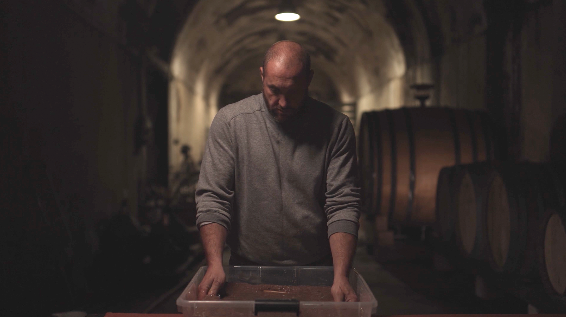
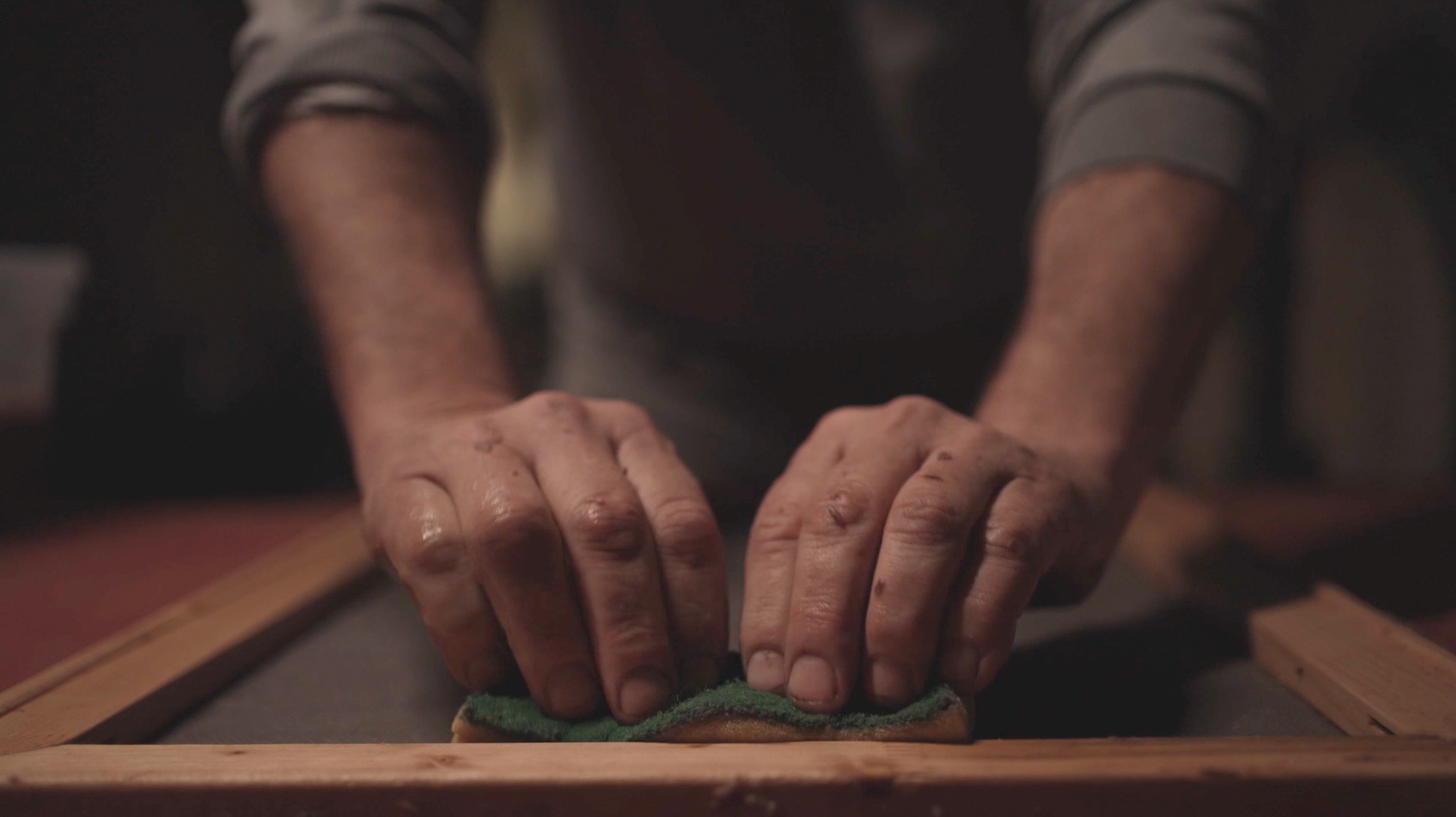
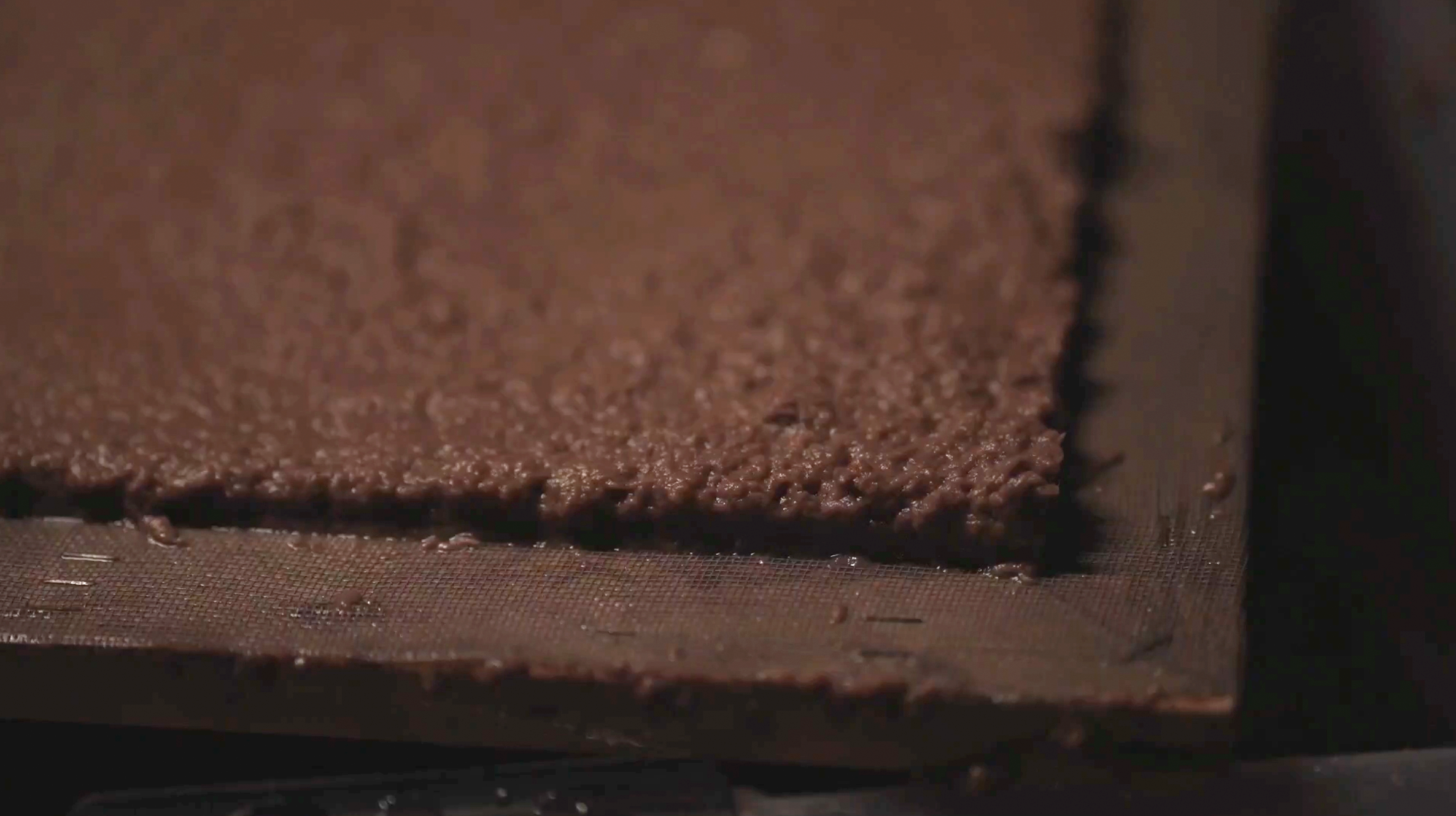
How do you design something that cannot be fully predicted, when its value lies precisely in the fact that every bottle becomes different over time? What actually remains in the designer’s hands in such a process?
We are glad you asked this question. And to answer it, we have to talk about what design actually is. It is often preoccupied with the idea of complete control over form and material… historically speaking, it reflects the pursuit of conquering, adapting and controlling nature and the environment. That pursuit has produced some of humanity’s greatest achievements, but also its worst disasters. Inspired by Piquentum, we asked ourselves why we should not be more accommodating and allow materials to behave exactly as they want to. Why not give objects the freedom to be completely unique, if their meaning and philosophy support it.
When designing the unpredictable, it actually turns out that the most complicated step is changing the way we think, changing our perception, as opposed to the constant attempt to change, improve or perfect everything around us.
So, what ultimately remains in the designer’s hands in such a process? The decision to consciously lose control. Our task was to create the framework, set the stage appropriately and then let go. We stepped out of the way and allowed the wine to finish the design of its own bottle and to be completely unique, completely its own.
Piquentum was not designed for a shelf, but for a restaurant and a conversation with a sommelier. Can the uniqueness of this bottle be fully understood without the story that accompanies it?
No, and that is where its greatest strength lies. If you placed this bottle on a supermarket shelf, someone would probably think it was a mistake, a dirty bottle or wine that had gone bad. And that is fine, because it does not belong there.
This label was designed as a tool for communication, for storytelling. It wants the guest to ask: “What on earth is this?” and at that moment, the sommelier gets the stage. They are not there simply to pour the wine, but become a storyteller who explains to the guest the production process, the nature of the wine, the role of time, sediment, nature… In this case, design literally directs human interaction. The uniqueness of the bottle does not live only in its visual appearance, but in that ritual of passing the story from one person to another.
Demand exceeded expectations, while production for 2026 and 2027 has largely sold out. What does this market reaction tell you about the audience’s relationship with products that are not standardized down to the last detail?
It tells us that we have entered a post-perfectionist era. People are tired of sterile, mass-produced products that look identical in every corner of the world, or of an excessive pursuit of perfection.
When you offer a consumer something that is not completely controlled, something in which the sediment creates a unique texture on every individual bottle, you are not really selling them only wine, but conveying the story of a specific place, a culture, a relationship with nature and heritage. A story about fundamental values. The incredible market response and vintages sold out in advance are proof that audiences today long for that genuine authenticity. They want imperfection because it is precisely in that imperfection, in that sediment and the unpredictability of nature, that they now see humanity.
Piquentum left Days of Communication with four gold awards. What would you like someone who will never know about those awards to recognize first in this project?
Awards are recognition from the profession, but at the end of the day, design has to communicate with the user. For someone who will never know about the awards, we would like them to recognize respect at first glance. Respect for nature, for the process of making wine and for the winemaker. We would like them not to see a design “trick” or a marketing gimmick in that bottle, but to feel a deep sincerity. We would like the user to understand that wine is not merely a drink to be consumed, but a living process in which they too participate at that very moment, becoming part of that larger, shared story.

