

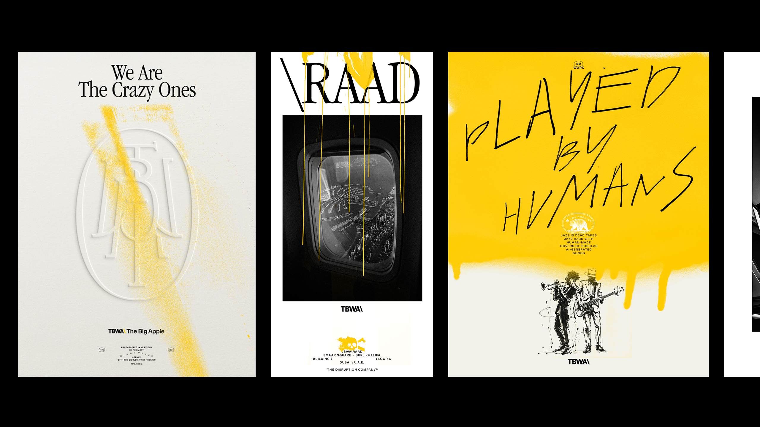
The yellow has stayed. The same goes for black and the recognisable backslash. Almost everything around them, however, has become softer, warmer and intentionally less perfect.
TBWA\Worldwide unveiled its new global visual identity in early August, developed by its in-house design discipline DXD (Design by Disruption). The former graphic rigidity has been replaced by brush and pen strokes, ink drops, spray, hand-drawn illustrations and photographs of people captured in motion.
The change has arrived at a time when generative tools are becoming increasingly present in creative processes, but the identity does not attempt to pretend that technology does not exist. Its message is more precise: when the same tools are available to almost everyone, the human perspective, experience and judgement become a more important part of what distinguishes one design system from another.
TBWA\Worldwide’s Global Chief Design Officer and Head of DXD, Bruno Regalo, described the new approach as radically analogue. Every decision, from photography to graphic elements, was intended to retain a connection with the network’s heritage while giving offices the opportunity to represent their own culture.
“In a world full of AI, the human, for us, is a strategic advantage,” said Regalo.
One of the more noticeable changes is the return of traditional serif typography. A new monogram has also been introduced, first created by hand and then digitally refined through the angles of TBWA’s characteristic backslash.
The familiar yellow is now used alongside a new shade called Analog. Its muted colour was derived from the tones of stationery paper, vintage envelopes and photographs taken with Leica cameras. Photography has also been given a different role. Posed portraits are making way for more spontaneous images that resemble moments from everyday work more than conventional corporate photoshoots.
The system also includes pirate illustrations, recalling the philosophy that has long accompanied TBWA and Steve Jobs’ famous idea that it is better to be a pirate than to join the navy. Their imperfection is not an additional decorative element, but part of the concept through which the agency places human craftsmanship at the very centre of the identity.
DXD calls this approach the Visual Brand Soul. According to Regalo, the task of design is not to produce individual assets, but to create a visual language that audiences can recognise before they even see the logo. “People don’t fall in love with brand guidelines, right? People fall in love with great design, something that they can see, but they can feel,” he explained.
At the same time, the new system must connect a broad group of agencies, including TBWA\Chiat\Day, adam&eveTBWA, TBWA\Media Arts Lab, TBWA\Hakuhodo, LOLA and Africa. For that reason, around 20% of the identity has deliberately not been strictly defined in advance. Local offices can develop their own versions of the backslash, city-related graphics and passport-like stamps.
This freedom is also visible in the film introducing the identity. Leaders from different parts of the collective draw their own versions of the backslash by hand, transforming the same sign from a precise corporate symbol into a series of personal marks.
TBWA\Worldwide’s Global Chief Creative Officer, Chaka Sobhani, stressed that design within the agency is not a separate service, but an integral part of its creative work. According to her, the new identity had to be recognisable enough to connect the entire collective, yet adaptable enough not to erase the differences between its offices.
The design and execution phase itself lasted approximately a month and a half, following earlier research and the gathering of input from teams and creative leaders across the network. The result was not conceived as a rulebook in which every detail is determined in advance. It is more reminiscent of a box filled with colours, stamps, letters and traces of ink, from which each office can take something of its own while the final picture still unmistakably belongs to TBWA.

