

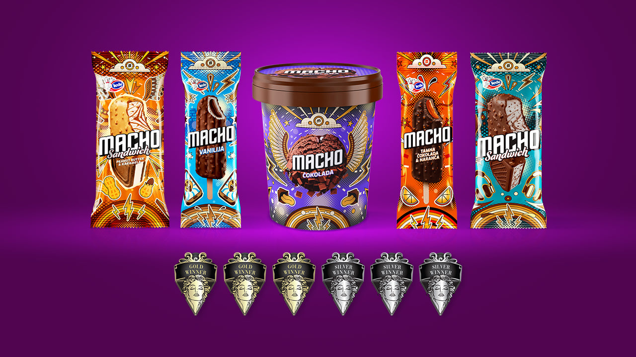
Designing a product that audiences are yet to discover offers plenty of freedom. Redesigning one that has had its place in freezers for decades, with a recognizable name, character and visual heritage, requires a little more caution. The change must be visible enough to bring the brand into a new era, but not so great that it loses what people recognize it for along the way.
That was the most difficult task for the new look of MACHO ice cream: to feel fresher without becoming unrecognizable. The redesign created for Ledo Plus by creative agency Spellcaster has now received international recognition for that approach as well: six awards at the MUSE Design Awards 2026, three Gold and three Silver awards.
The awards came in the categories Packaging Design – Snacks, Confectionary & Desserts, Packaging Design – Dairy, Spices, Oils, Sauces & Condiments and Packaging Redesign / Refresh. The project was thus recognized not only for the execution of the packaging, but also for the way the existing identity was adapted to a more contemporary visual language.
The starting point of the redesign was not to change MACHO from the ground up. On the contrary, its name, attitude and already established recognizability became the basis for finding its new version. The visual system draws on influences from pop art and street culture, through stronger colors, more pronounced graphic elements and packaging that speaks a little louder on the shelf than before.
Behind that change lies a question that accompanies almost every refresh of an established brand: how far should you go to keep the product relevant to new generations, while ensuring that its existing audience still recognizes “their” brand in it.
“Our favorite redesigns are the ones that, in the end, make it look as though the brand should always have looked exactly that way. MACHO already had a name, an attitude and an enormous amount of recognizability – our job was not to reinvent it, but to find its contemporary version. Six awards for the same project are quite a nice confirmation that we got something right.”, say the team at Spellcaster.
At Ledo Plus, they emphasize precisely that balance between continuity and change.
“MACHO is one of those products that has character. The direction of design development for such a brand always comes with a certain challenge. We want to remain relevant to new generations while at the same time preserving what makes consumers recognize and love it. That is precisely why we are especially pleased that MACHO has received international recognition from the profession.” the company states.
MUSE Design Awards is an international competition that brings together projects and authors from different design disciplines, including branding, packaging, product and architectural design. Among the brands awarded at this year’s edition are also Ferrero Rocher, Kinder, Dom Pérignon and Tullamore D.E.W.
For MACHO, however, perhaps the more important part of the story is that the six awards did not come from an attempt to become something completely different, but precisely from the way it was changed enough to feel new, while remaining familiar enough that it does not need to be introduced to the audience again.

