

Photo source: Ads of the Worls
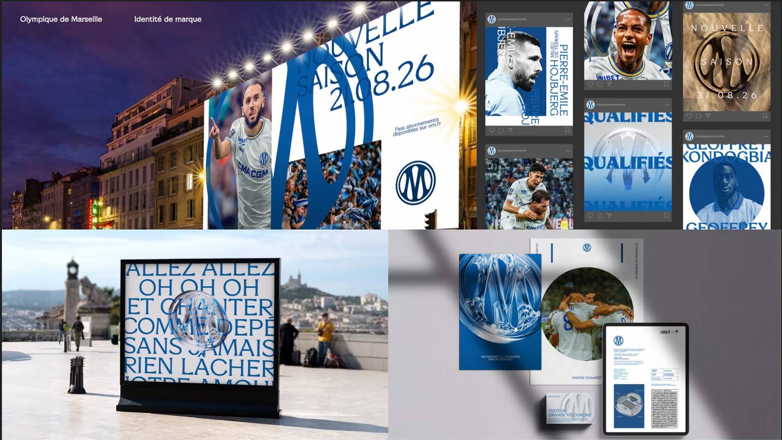
Photographs of fans served as material for graphic patterns in Olympique de Marseille’s new identity. Processed into textures, the Vélodrome stands found their place in a visual system applied across the club’s communications, spaces and products. This approach illustrates the project’s starting point: what makes the club recognisable at home should help it become recognisable far beyond Marseille.
Under the name Unfiltered Football, or Football sans filtre, the club unveiled its brand platform this October, developed with agency Leroy Tremblot, part of The Fan Syndicate group. The task was to bring OM closer to new generations and audiences beyond football while preserving the directness and intensity of its fan culture. Local belonging was therefore placed at the heart of its international positioning.
The division of creative responsibilities is important here: the new logo and colour palette were designed by the club’s internal teams. Leroy Tremblot took on the development of the platform and worked out how these elements would be used across different media and environments. The project thus gave the established visual foundations a broader application in communications and commerce.
The palette combines Marseille Blue and Deep Sea shades with white and gold accents, while a bespoke typeface, OM Marseille, was developed for the club. Its geometric shapes and subtle serifs draw inspiration from the Mediterranean way of life, the light and the city’s coastline. The system also allows for three levels of photographic treatment, from natural to stylised, so that the look of the communications can be adapted to the content. Photographs of the crowd further connect this design language with the people in the stands.
For fans, the practical aspect of the change lies in digital services. The website, ticket sales, online shop, app and members’ area had previously been built on different technologies. Working with digital studio Velours and the club’s IT department, the agency brought them together into a consistent user experience. The work took nine months and included redesigning om.fr and developing a design system now used by four external teams.
The same identity was applied to the CEPAC Vélodrome stadium, the Robert-Louis-Dreyfus training centre and the new headquarters on Avenue du Prado. Its application was adapted to their users, from fans to employees, while shared visual elements connect the spaces with the rest of the club’s communications.
The commercial side of the project was developed through guidelines for five product collections, each with its own story linked to different facets of Marseille. The collections complement the official sportswear supplier’s range, with the aim of entering additional categories and attracting new customers. Employer branding was also included: the club redefined the values and principles through which it aims to attract employees and convey the club’s culture within the organisation.
The scope of the project shows where OM sees room for growth. Alongside sports communications, these areas include shopping, digital services, products and recruitment, connected by the brand’s recognisable origins. Whether this approach will attract a wider audience remains to be seen, but the club has established a system through which it can pursue that ambition.

