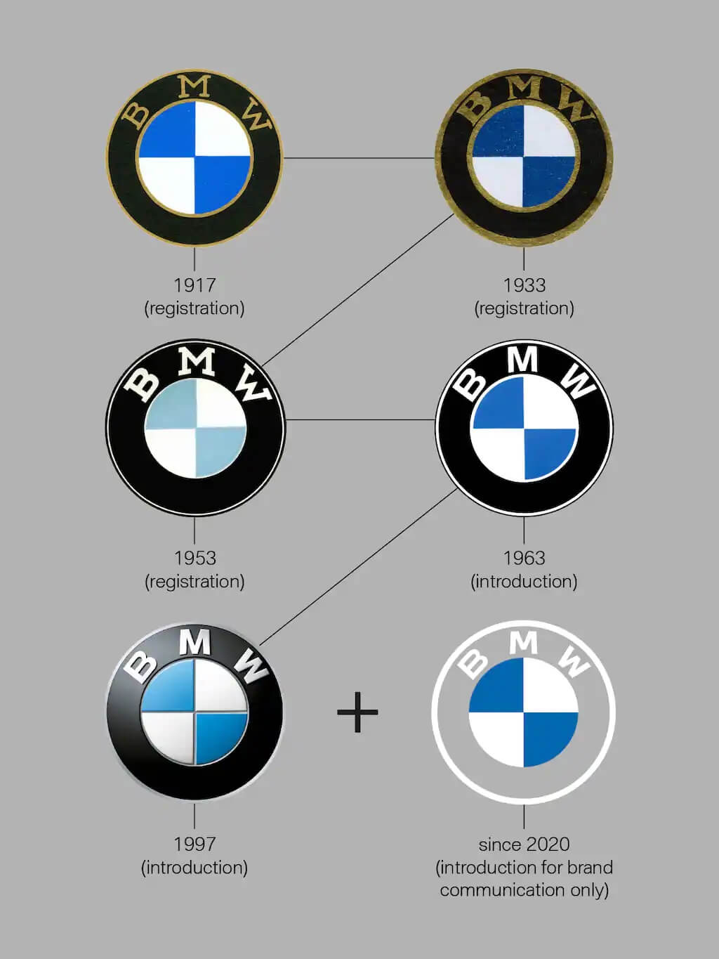
The German automaker BMW has unveiled a refreshed logo design which replaces the black ring with a transparent circle, as well as an overal flat design that the company believes feel more modern and will resonate more with the younger audiences.
One thing that has remained unchaged is the blue and white emblem inside the ring, for which there is a deeply rooted belief it represents a stylized airplane propeller, all thanks to an old marketing push that promoted airplane engines of the company.
The new logo, which will be used in BMW’s communications efforts, including its social media platforms and website, is meant to “radiate more openness and clarity,” Jans Thiemer, BMW’s senior vice president of customer and brand, said in a statement on the company’s website. He added that the new look also symbolizes BMW’s “significance and relevance for mobility and driving pleasure in the future.”
But what does the BMW logo mean? And what does the BMW badge represent? The company explained in their “BMW explained” series.
There was no need for a BMW symbol at first
The history of the name BMW – the Bayerische Motoren Werke or Bavarian Motor Works – dates back to 1917. BMW emerged from a renaming of the aircraft engine manufacturer Rapp Motorenwerke, located in Munich, the capital of the State of Bavaria in southern Germany. Although the company name changed, the technical equipment, assets and workforce initially remained the same.
When the name BMW was first included in the commercial register in July 1917, there was no company logo. Similarly, the first ad from the same month also lacked any BMW symbol or emblem. What it did feature alongside aircraft engines, however, was its future planned product range: Engines for automobiles, agriculture and boats.
“In the early days, the logo and its meaning were by no means as present to a broad public as they are today, as BMW had no end customers to solicit,” explains Fred Jakobs, Archive Director at BMW Group Classic. The main business was the production and maintenance of aircraft engines for the German Air Force.
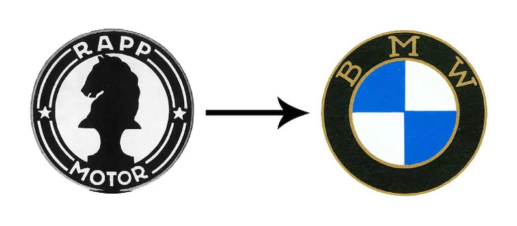
BMW emerged from the firm Rapp Motorenwerke GmbH (1913-1917). This can also be seen in the first BMW logo from October 1917, which continued Rapp’s tradition of having a black ring around the company logo bearing the company name.
The BMW Logo features inverse Bavarian colors
Nevertheless, on October 5th, 1917 the young firm received a company logo. This first BMW badge, which was registered in the German Imperial Register of Trademarks, retained the round shape of the old Rapp logo. The outer ring of the symbol was now bounded by two gold lines and bore the letters BMW.
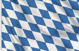
The company’s home state of Bavaria was also to be represented on the company logo. The quarters of the inner circle on the BMW badge display the state colors of the State of Bavaria – white and blue. But they are in the inverse order (at least as far as heraldic rules are concerned, where you read clockwise from the top left). The reason for this inverse order of blue and white in the BMW logo was the local trademark law at the time, which forbade the use of state coats of arms or other symbols of sovereignty on commercial logos.
So where does the propeller myth about the BMW logo come from?
Even today, many people still believe that the BMW logo depicts a rotating propeller. How come? The myth of the BMW propeller came about years after the first company logo. A BMW ad from 1929 showed an airplane with the BMW logo in the rotating propeller. At the beginning of the global economic crisis, the ad was trying to promote a new aircraft engine that BMW was building under license from Pratt & Whitney. The propeller interpretation fit very well into the advertising image of the young company, as it underlined the company’s roots and its expertise in aircraft construction.
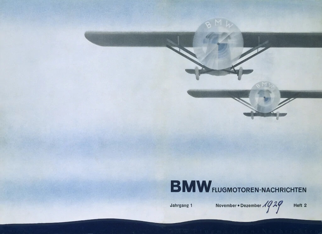
Since this BMW publication from 1929, the myth that the BMW logo is a propeller has endured.
Then, in 1942, BMW itself linked the propeller to its company symbol. An article appeared in a BMW publication called “Flugmotoren-Nachrichten” (Aircraft Engine News) which backed up the story of the BMW badge as a spinning propeller. The story was illustrated with a photo of the BMW logo overlaid on a rotating propeller.

BMW did not make any serious efforts to discourage this myth. In fact, it continued to represent the BMW emblem as a propeller, like this 1942 illustration from the company’s works magazine.
The BMW logo: meaning and history?
So the story of the BMW logo is based on a legend – a legend that still lives on today. “For a long time, BMW made little effort to correct the myth that the BMW badge is a propeller,” explains Fred Jakobs of BMW Group Classic. So according to the expert, sticking to the story that the BMW emblem is a propeller would not be entirely wrong. It’s not strictly true that there is a propeller in BMW’s company logo, though. Constant repetition has made this explanation a self-propagating urban myth. “This interpretation has been commonplace for 90 years, so in the meantime it has acquired a certain justification,” Jakobs explains.