
Images source: Museum of Illusions
Museum of Illusions is developing on a global level with a clear objective: to align the experience across a network of more than 70 locations in 29 countries and across five continents. And it all began in Zagreb, where the first Museum of Illusions opened in 2015. Today, it is an internationally recognised concept, most present in Europe and North America, which is increasingly transforming from a traditional museum format into an experience brand.
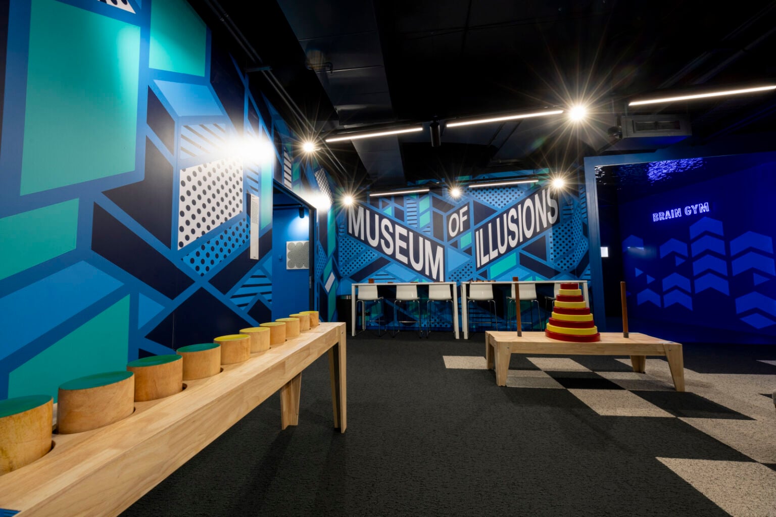
In this process, Brigada assumed a strategic role in designing the spatial experience through a systematically conceived visitor journey, the positioning of exhibits, as well as new zones that themselves become exhibits. The goal was not only to improve spatial organisation, but to intensify visitor engagement: to introduce more rhythm, more surprises and more carefully calibrated perceptual shifts that make the experience more dynamic, layered and memorable.
Agency Bruketa&Žinić&Grey joined the project to develop a graphic system that would translate this strategy into a clear, consistent and recognisable visual language. Within the spatial dynamics, it was necessary to create graphics that would naturally integrate into the interior, respect the existing key identity elements of Museum of Illusions (primarily the logo and characteristic colour palette) while additionally reinforcing the authenticity of the experience itself.
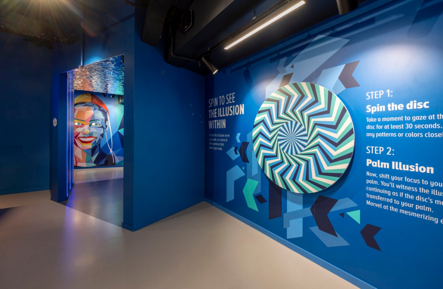
The uniqueness of the Museum of Illusions brand lies in the fact that it does not invite visitors merely to observe, but also to participate. Taking photographs within the spatial illusions is not supplementary content, but an integral part of the experience. The illusion does not end within the space itself; it continues through the frame, the screen and sharing. Precisely for this reason, it was necessary to develop more than twenty mutually different graphic solutions that enrich individual installations and zones, while simultaneously ensuring that the brand remains clearly recognisable outside the museum itself – in photographs, videos and social media posts.
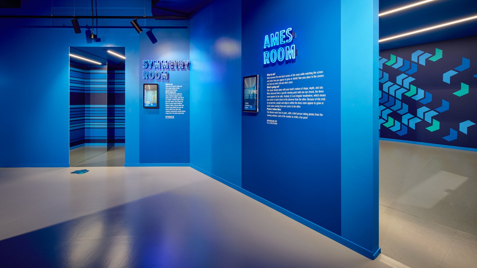
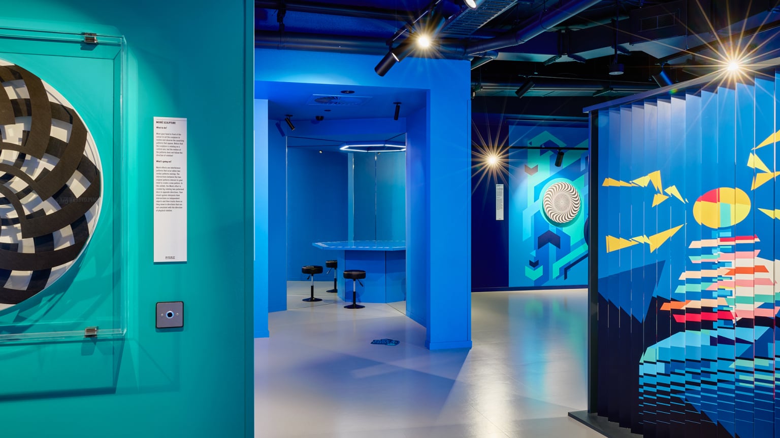
But the role of these graphics is not only aesthetic. They direct the gaze, amplify perception, define the rhythm of movement and subtly guide visitors through the space. In that sense, they function simultaneously as a visual identity, an orientation tool and an extension of the illusion itself.
The graphic system was developed from elements taken from the Museum of Illusions logo, more precisely from its negative spaces. These elements became the basic units of a flexible pattern system which, within the same modular grid, through different principles of repetition and scaling, produces a series of entirely different spatial impressions. Additional diversity is introduced through colour combinations and changes in scale, but without losing coherence. The system is therefore disciplined enough to remain consistent with the brand, and sufficiently open to respond to different spatial and perceptual situations.
In the design process, one thing was crucial: that the graphics should not compete with the illusion, but support it. That they should not take over attention, but direct it. That they should not function as decoration, but as an active layer of the experience. For this reason, individual solutions were verified and tested in real space, including full-scale 1:1 tests, in order to precisely align the relationship between graphics, architecture and perceptual effect.
The result is a system that further distances Museum of Illusions from the classical museum typology and strengthens its position as an immersive experience brand. Today, the brand functions as a globally recognisable framework, but also as a flexible tool that can adapt to different locations without losing its identity. Between space, graphics and movement, an experience emerges that is not only consistent, but also shareable, memorable and alive – exactly how a contemporary brand should function.


