

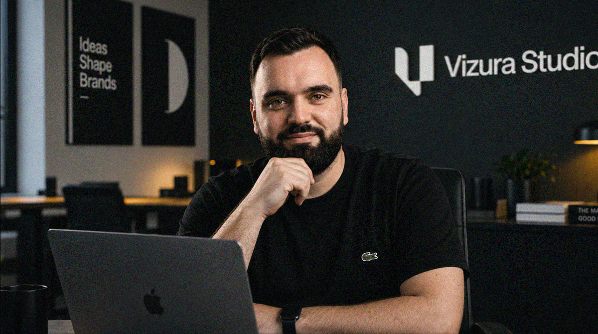
Major international clients, complex projects, and ambitious brands are usually associated with agencies employing dozens of people. However, Zagreb-based Vizura Studio is developing a different business model. Behind the studio is a single designer who independently manages projects from strategy and positioning to visual identity and web design, working with companies from different parts of the world. The decision to remain a one-person studio is not the result of limited opportunities for growth, but a deliberate choice to work in a way that maintains a direct relationship with the client throughout every stage of the project.
Among the companies he has worked with are American startup Mirai, backed by a16z speedrun, Deepsea Networks, which provides communication solutions for the maritime and offshore industries, and Verticomm, a company with more than 25 years of experience in the enterprise IT sector. Their products, customers, and business challenges differ significantly, but they share a need to present complex services and technologies in a way that allows customers to understand their true value.
In an interview with Media Marketing, Vizura’s founder Vedran Obradović discusses how to build an international creative business from Zagreb without a large agency team, why good design begins with understanding the business problem, how to help technology companies stand out from the competition, and where human creativity and professional judgment remain essential in an era of increasingly accessible AI tools.
You launched Vizura with the ambition of working on international projects from Zagreb. How did you land the first client who showed you that this kind of business was truly possible, and what did you have to learn to win them over?
I wouldn’t embellish that story with a single “first client” who suddenly changed everything. What really confirmed to me that the model could work was the moment when people outside Croatia started choosing my work because of my portfolio, my way of thinking, and our conversations, rather than where I was physically located. That mattered much more to me than geography itself.
The biggest lesson was that good design isn’t enough if you can’t clearly explain why you’re doing something. I had to learn to talk about the business problem, not just aesthetics. What is the company trying to change? Who does it need to convince? Where is its current brand creating friction? Once that part becomes clear, location becomes a much smaller factor. That remains the foundation of my work from Zagreb today: specialization and clarity can travel much more easily than people think.
You consciously decided to remain a one-person studio. What does this model allow you to do, and where do you feel its limitations? How do you challenge your own ideas when you don’t have a team to question them with every day?
The biggest advantage is continuity. From the first conversation to the final detail, the client works directly with me. There is no handover between sales, account management, strategy, and design where part of the context gets lost along the way. That suits me because a brand isn’t a series of separate deliverables anyway. Positioning, language, identity, and the website all need to follow the same decisions.
The limitation is obvious: I don’t have five people in a room who can tear apart a bad idea in ten minutes. That’s why I try to be pretty brutal with my own concepts. I bring them back to the problem, test whether I can explain a decision without design jargon, and see whether the system works beyond a beautiful mockup. I also use AI as a tool for challenging ideas, research, and testing scenarios, but not as an arbiter of taste or strategy. The final judgment has to remain mine, because the responsibility remains mine too.
You say you’re particularly drawn to companies whose products are better than their brands manage to communicate. How do you recognize that gap? Can you walk us through a project where a request for a new design actually concealed a problem with how the company explained its business?
I usually recognize it when a conversation with the founder or team is much more convincing than what I see on the website. In conversation, you hear precisely why the product is valuable, where it’s technically demanding, and why customers trust the team. Then you open the company’s public presentation and find generic “innovative solutions” language, the same visual codes as five competitors, and very little evidence. That’s a perception problem, not just a design problem.
Deepsea Networks is a good example. Offshore connectivity is literally an invisible product: signal, uptime, infrastructure, and people who have to work in difficult conditions. If I had treated the project as a classic “telecom redesign,” I would have missed the main point. The brand and website needed to make reliability tangible and explain a complex portfolio without turning everything into a wall of corporate technical information. That’s why the entire experience was built around descending from the surface into the depths, with real content beneath the 3D layer so the story would remain clear to people, search engines, and AI tools.
Mirai and Deepsea Networks operate in very different industries. What did you need to understand about their products and customers before you started designing, and how was that reflected in the final solutions?
With Mirai, I first had to understand that the product wasn’t just another tool for viewing real estate. Its value lies in what a standard property listing usually doesn’t show: what a location feels like, what’s around the address, and what everyday life there might look like. That’s why the identity couldn’t feel like a cold data layer. It needed to be more local, more approachable, and simple enough to work across everything from the app and favicon to a sign outside a property and a QR tour.
Deepsea is almost the opposite context. There, the customer isn’t looking for a sense of neighborhood but for confidence in the system and the people operating in an environment where a loss of connectivity can be a serious operational problem. The visual language therefore communicates through signals, waves, telemetry, infrastructure, and real working conditions. Same process, completely different criteria. I don’t try to impose Vizura’s “style” on a client. I try to find a visual and verbal language that makes sense for their product and their customer.
You worked on the rebranding of Verticomm, a company with more than 25 years of business history. How did you decide what to preserve and what to change? Was there a decision on which you and the client initially disagreed?
With Verticomm, my starting point was continuity, not erasing the past. The company already had a name, reputation, and recognition in enterprise IT. So the question was how to preserve a sense of stability and the “V” as a connection to the existing identity, while building a system that looks like a company moving toward larger enterprise clients.
Interestingly, the biggest initial disagreement wasn’t between Chris and me about the final direction, but between what I considered sustainable and the solution that existed before I joined the project. The previous symbol had a trademark issue, and the replacement version felt too generic and visually unbalanced to me. The relationship between the wordmark and the large “cybersec, AI, IT” descriptor particularly didn’t work for me. I suggested that instead of patching up the logo, we create a more substantial identity system and guidelines that could last. Chris accepted that broader approach. For me, it’s a good example of why rebranding an established company isn’t a question of “how much will we change,” but rather “what needs to remain familiar to preserve trust, and what needs to evolve so the brand no longer looks like an earlier stage of the company.”
Many technology companies use similar visual languages and almost identical messages. Why does this happen, and how do you build brand distinctiveness in such a category? What role do AI tools play in your process and in this growing similarity?
It happens because everyone looks at the same references, uses similar tools, and optimizes toward the same signals of “what looks like tech.” Add generative tools that are statistically very good at producing what already exists in large quantities, and the average becomes even easier to produce. A gradient, an abstract symbol, a couple of phrases about transformation, and suddenly ten companies look like relatives.
That’s why it’s more important to me to find one idea a brand can truly own than to create another “good” composition. With Breach, it was a precisely constructed geometric symbol that was deliberately interrupted. That cut carries the entire “break through complexity” idea. When such a principle exists, AI can be useful for iterations, research, variations, or testing applications. Without a principle, it simply accelerates the production of generic material. The problem isn’t that AI generates images. The problem is when a company doesn’t have clear enough criteria to know which images don’t belong to its brand.
When a new identity starts being used across sales presentations, the website, and everyday communication, how do you and the client assess whether it has solved the original problem? Can you share a piece of feedback or a result that showed you one of your decisions had truly made a difference?
The first thing I look at is whether the brand has become easier to use, not just more beautiful to look at. Can the sales team explain the company without improvising? Can marketing create a new campaign without reinventing the rules? Can someone outside the project open the system and make the right decision without me? If an identity only works when the designer is there to hold its hand, then it isn’t finished.
With Breach, what mattered to me was the client’s reaction that the identity clearly captured both the technology and the ambition behind the company. That’s not “+37% of something,” and I wouldn’t invent a metric just because it sounds better in an interview. To me, a more valuable signal is when the client recognizes that the design finally articulates what they’ve been trying to say about themselves. With Deepsea Networks, I take it a step further through Brand OS: rules, assets, templates, and AI context all live in one operating system, so success isn’t just launching a new website, but how consistently the brand can continue to live after the handoff.

