


For years, the propeller has been one of the most recognizable symbols of the Slovenian Advertising Festival (SOF), known to the Slovenian advertising industry also as the Agency of the Year award. This very symbol became the starting point for the festival’s new visual identity, which will be used for the first time in 2027. Its creator is Strahinja Jovanović, a multi-award-winning graphic and digital designer at Futura DDB, whose proposal was selected through an open competition.
Jovanović found inspiration in a simple question: what would the propeller look like if it actually started spinning? Although it is an object whose primary function is movement, it has mostly been depicted as static in previous festival materials. By experimenting with rotation, repetition, and overlapping its basic shape, he developed geometric patterns that create a sense of movement even when they are not animated.
“When developing the visual identity, what mattered most to me was that the system should not be based on constantly creating new graphic elements, but rather on exploring the possibilities offered by a single starting shape. By repeating, rotating, overlapping, and modifying it, an almost unlimited number of visual combinations can be created,” explains Jovanović.
One of the key elements of the new identity emerges from overlapping the propeller with the letter O from the SOF logo. This creates three distinctive areas that determine the use of three primary colors. Their combination can change from year to year, giving each subsequent edition of the festival its own visual expression while preserving the recognizable geometric foundation.
The system has been developed for use across digital and printed materials, from simple graphic solutions to more complex compositions. In animations, the shapes can separate, merge, and open up, while also serving as masks that reveal photographs, text, and video content. This approach allows the identity to evolve across multiple festival editions without the need to change its core concept.
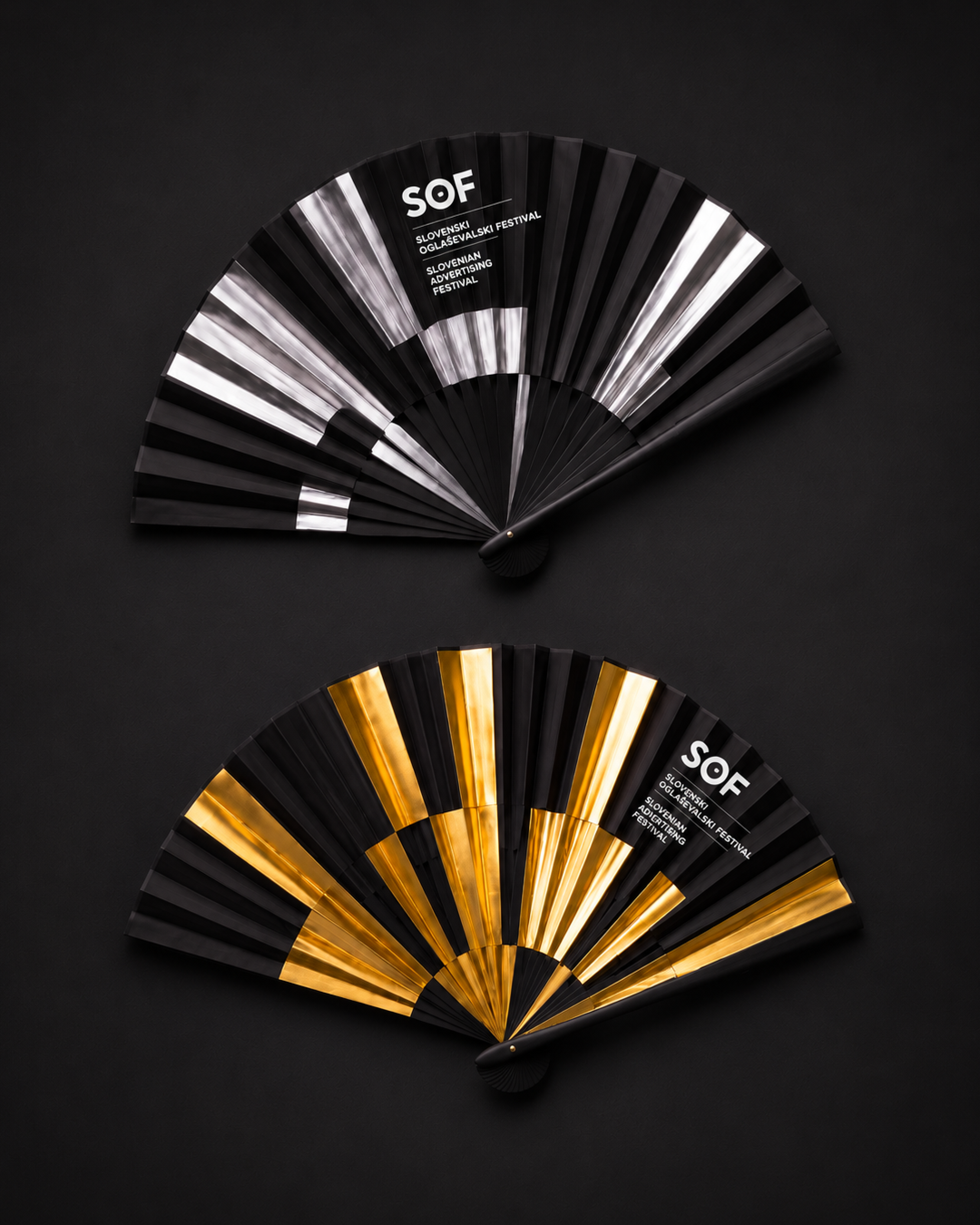
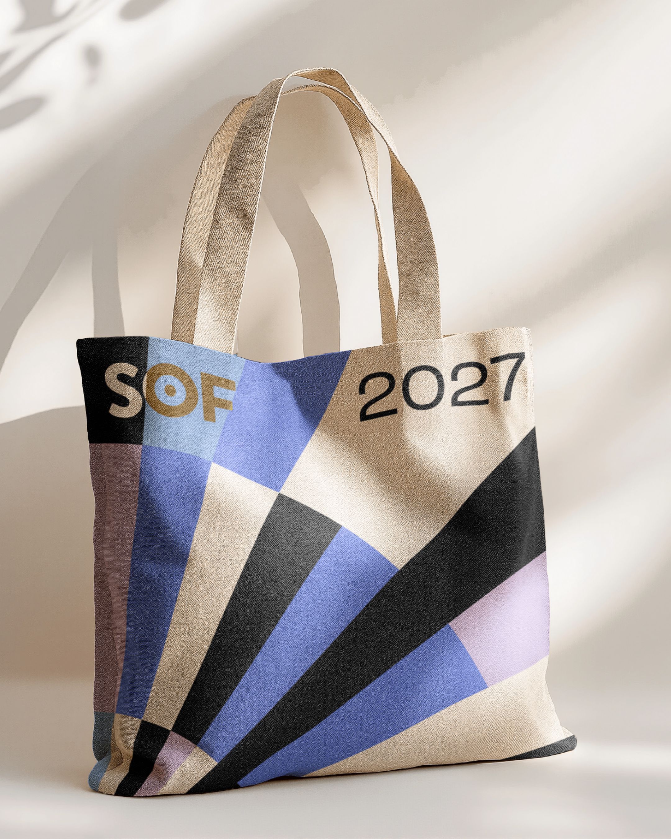
Behind the new visual identity is Futura DDB, an agency that has won the Agency of the Year title at SOF 15 times and has also received 15 Red Dot awards among its international accolades. This year, it also won the Agency of the Year title at the regional Kaktus festival in Belgrade, as well as the award for the best Slovenian agency at the BalCannes competition.
For a festival that brings together the Slovenian advertising industry each year through its professional program and competition for the best work, the new identity introduces a visual system designed to last beyond a single edition. As summarized in its core concept, the propeller remains the same, yet never entirely identical.

