Drugi jezik na kojem je dostupan ovaj članak: Bosnian
Although development of its economy is mostly based on tourist offer, Croatia could soon be recognized as the leading IT services exporter. According to research, many IT companies are gaining significant ground in the Western market.
Redok, one of the leading agents in the exchange of electronic documents in South East Europe, wished to expand its business to the Western market, and towards achieving this goal they opted to create a better definition of their brand.
Redok’s rebranding was done by a team of award-winning branding experts from the Fabular agency, who for some time now are intensively working on the rebranding of many Croatian IT companies.
“With the development of the IT sector, and with the goal of expanding to foreign markets, IT experts are becoming more aware of the importance of communication with the target group and the branding itself. Branding was once considered to be just the design, and now it is much clearer that branding and rebranding imply creating a strategy and a new, strengthened meaning of a product or service among its users. Clarity of the message and a concrete description of the offer are key elements for a successful business,” said Anja Bauer Minkara, CEO of Fabular.

Over the years Redok has developed one of the finest EDI (electronic document interchange) software solutions, but the company’s image was not strong enough and not relevant enough. The visual identity seemed outdated, while the name Redok was unclear to the target group.
According to Fabular, the new brand strategy was inspired by the personality of the company’s CEO, Nino Stajher, whose “nothing is impossible” attitude helped him successfully complete the Ironman challenge, one of the most demanding triathlon races.
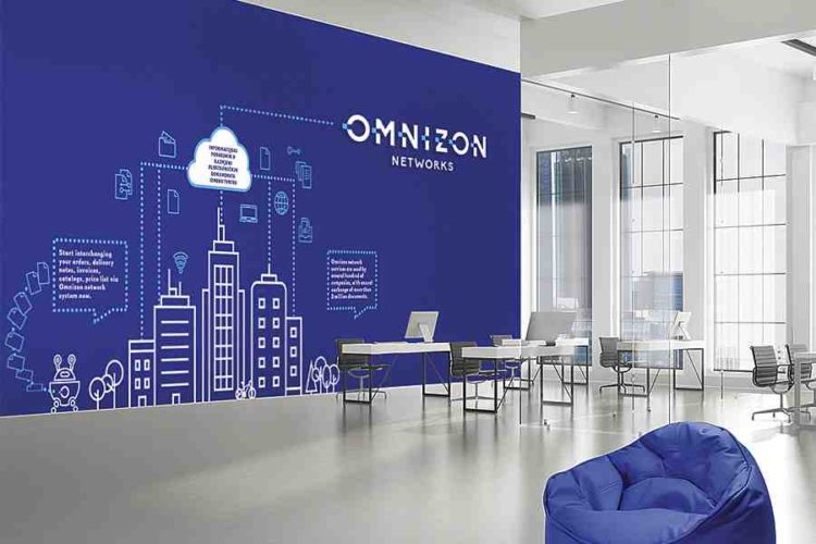
“The positioning of the brand is based on creating feelings of strength, omnipotence, and being in the zone, so the name Omnizon Networks was created, signed with the slogan Mission possible. Brand promises to save time and money and to make each company and its employees more productive. Omnizon Networks makes the impossible possible,” Bauer Minkara added.
In charge of the new visual identity was art director Maja Bagić Barić. In order to communicate the key brand attributes – speed and simplicity – Bagić Barić created a minimalist Omnizon Networks logo. The logotype consists of a typographic solution in which the parts of the letters are separated from the structure and are shown in a different color, thereby achieving the effect of a dotted line which is associated with speed and motion.


