

The bottle of Croatian small batch whiskey Nebo was shaped to resemble a telescope, while the illustrations on its label preserve the stories of Faust Vrančić and Slavoljub Penkala. This combination of structural design, aeronautical heritage and detailed craftsmanship earned the project a gold medal at the international SIP Bottle and Packaging Design Awards competition.
The packaging was developed for craft distillery Duh u boci by Croatian branding agency Kofein, which was responsible for the bottle shape, cap, label and the brand’s broader visual identity. Instead of relying on the expected codes of the whiskey category, the concept starts from the name Nebo itself and the distillery founders’ interest in flying, exploration and technical precision.
The proportions of the glass bottle were inspired by a telescope, an instrument that directs our gaze toward what is not immediately visible. The reference was not translated literally. The elongated silhouette, slightly widened base and relationship between the individual elements create an association that becomes clearer only upon closer observation. The story continues with a specially designed glass cap with a wooden crown. Its opening resembles an eyepiece, while the lower section is shaped after the form of a lens. In addition to completing the bottle’s silhouette, the cap gives the opening experience weight and a sense of ritual that corresponds with the product’s premium positioning.
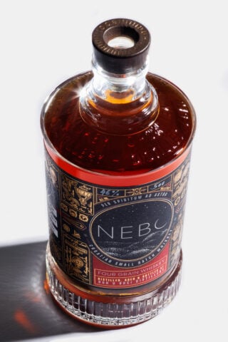
Most of the information is placed on the matte black label with embossed gold illustrations. The visual motifs follow the development of humanity’s desire to fly, from mythical representations to pioneering aeronautical achievements. The illustrations, typography and finishing techniques were designed so that the details are not revealed all at once. The packaging therefore functions as an object that can be examined even after it has fulfilled its primary purpose.
“We did not want to create a bottle that simply looks beautiful on a shelf. We wanted to create an object that people would keep long after the whiskey has been consumed. Every design decision was guided by the same idea: to express exploration, craftsmanship and the spirit behind the name Nebo,” said Tomislav Krajačić, CEO of Kofein.
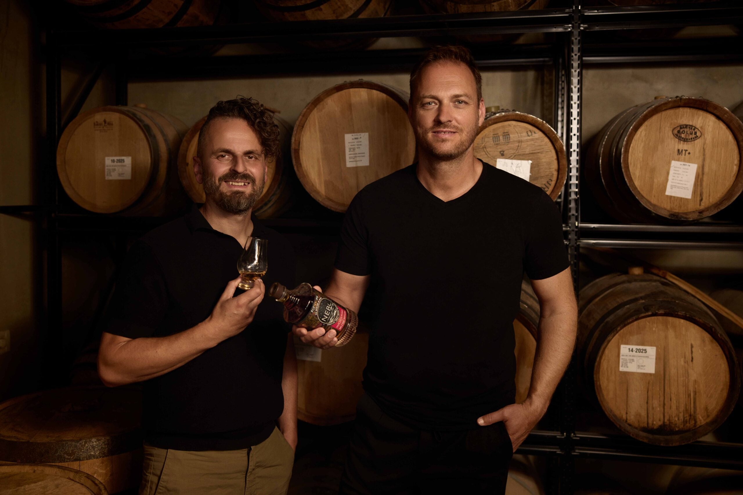
Distillery Duh u boci, also known for the internationally awarded brand Old Pilot, introduced Nebo as a new Croatian small batch whiskey line. The portfolio includes the Four Grain, Single Malt and Peated Single Malt editions, produced by combining local and international ingredients with unconventional ageing methods.
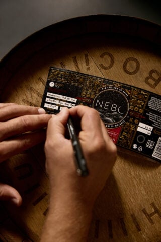
The agency’s task did not end with the design of an individual bottle. A system was developed that includes the logo, different editions within the line and the brand’s digital presence. In the logo, the letter “o” was transformed into a crescent moon, transferring the sky motif into a detail that can also function beyond the packaging.
The gold medal at the SIP Awards went to a project in which the bottle shape does not serve as a decorative backdrop for the label. The telescope, optical instruments and the history of aviation are built into the object’s structure itself, allowing the idea of exploration to remain visible regardless of the side from which the bottle is observed.

