


Drugi jezik na kojem je dostupan ovaj članak: Bosnian
Italian football club Juventus’ decision to rebrand their iconic club crest has been met with widespread criticism from commentators and fans alike.
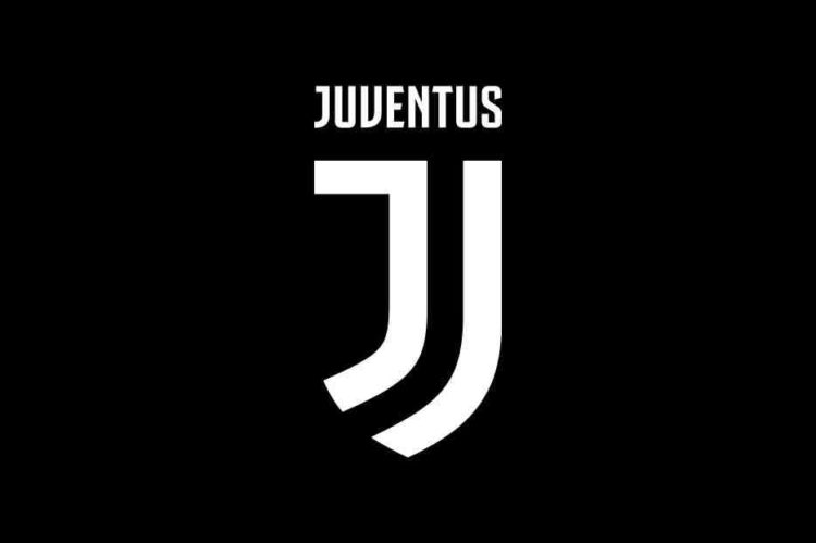
The new minimalist design sees the Italian side drop their famous vertical black and white stripes inside an oval crest in favour of a monochrome ‘J’ inside half a white shield.
It will be officially adopted from July 2017 and was unveiled Monday evening at a star-studded event in Milan, Italy alongside a promotional video.
The club’s president, Andrea Agnelli, revealed that the logo was over a year in the making and described it as “a symbol of the Juventus way of living”.
“These three elements make up the DNA of our club. The black and white stripes are the defining trait of the new visual identity and can be adapted to fit any setting,” said Agnelli.
He added: “The Scudetto represents the club’s determination to strive for victory, now and forever. And finally, the J: that most distinctive of initials, occupies a special place in the heart of every fan.”
It appears however that the new crest raised quite a stir as majority of fans and football media voice their dissatisfaction on social networks, condemning the dropping of traditional features of the crest.