

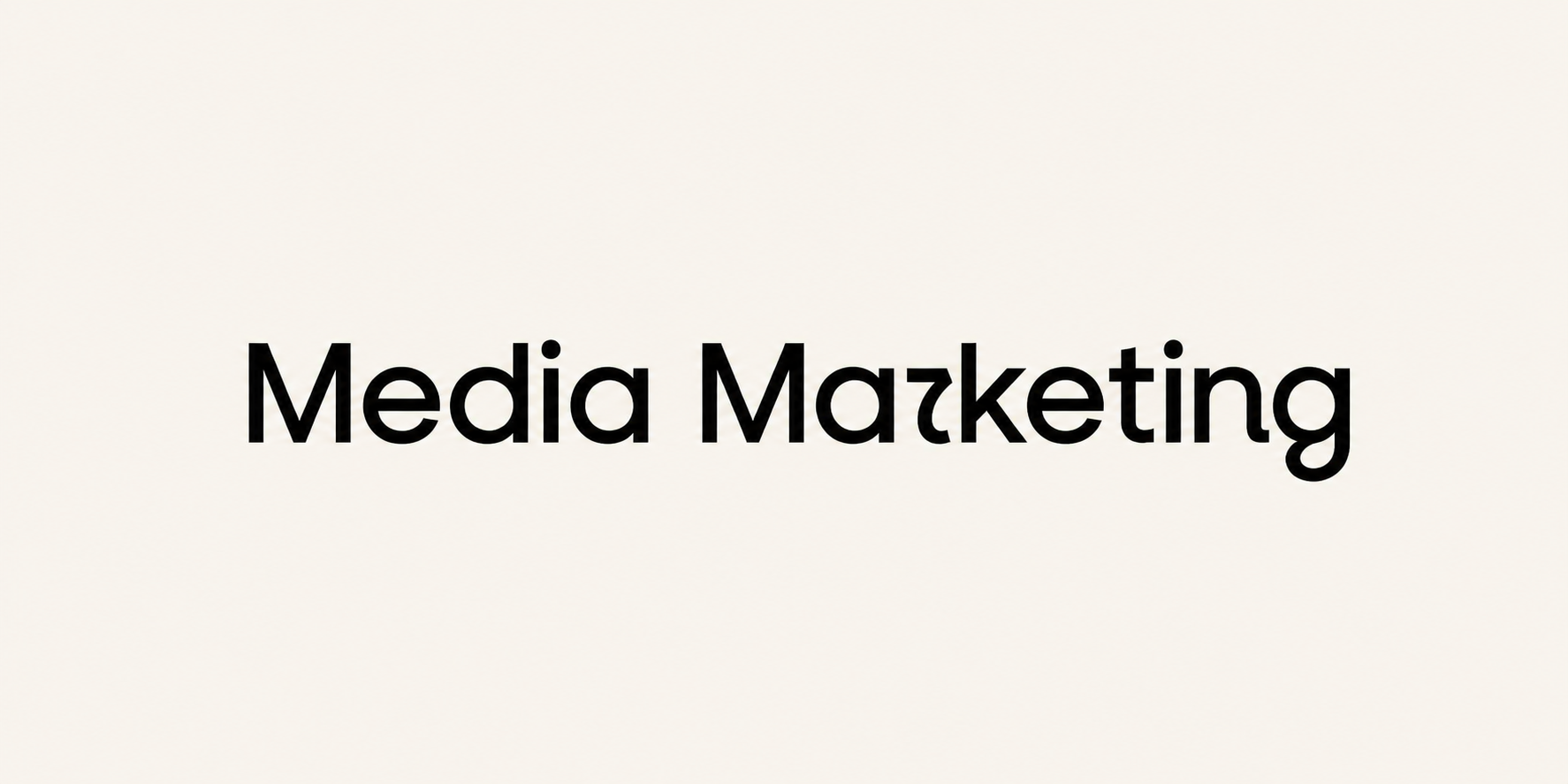
One letter was enough to give Instagram’s first major identity refresh in more than ten years a continuation that the design team probably could not have planned in advance. The new handwritten mark was unveiled on 13 August, and users almost immediately began reading the connection between the letters “r” and “g” as a “z”. Instagram thus briefly became “Instagzam” on social media, and brands soon took over the debate about its legibility.
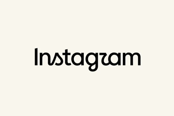
Instagram did not change its multicoloured camera icon. What changed was the wordmark, the rendering of the name that appears at the top of the app, as well as the broader system in which the mark will be used. The new identity includes a refreshed Instagram Sans typeface, the new Instagram Pen and Instagram Sans Mono type families, photographic markings, a frame derived from the shape of a camera viewfinder and more restrained use of the recognisable gradient.
Head of Instagram Adam Mosseri explained that the wordmark had not changed in ten years and had begun to feel dated. He described the new mark as sharper and more modern, while still referencing the original and retaining the simplicity and craft that Instagram wants to preserve.
The design team also considered abandoning the script wordmark entirely. However, the versions without it felt too far removed from the identity that users had known for almost their entire digital lives. The script therefore remained, but became bolder, simpler and composed of more loosely connected letters.
“Every time we stripped out the script, we became unrecognisable to ourselves. Walking away from it entirely felt like walking away from the unique qualities of who we are,” said Cynthia Pratomo, director of brand design at Instagram.
According to Pratomo, Instagram no longer has a single voice. Carefully art-directed campaigns, blurry concert photographs, vacation photo dumps, personal memories and memes all appear in the same place. The new identity was therefore not assigned one firmly defined tone, but the task of accommodating serious, encouraging and edgier messages without losing its recognisability.
The change is particularly visible in how Instagram uses colour. The gradient that carried much of the identity for years will appear more selectively, sometimes as a light leak on photographic film. Contact sheets, registration marks, handwritten annotations and the viewfinder frame further reconnect the identity with the process of making an image.
“The whole goal with this new system is to actively champion everyday creativity and make imperfection feel totally normal,” said Christy Silva, creative director of brand design and creative marketing at Instagram.
The most visible addition to the system will be Instagram Pen, a typeface developed from the marks made by different pens and writing styles. It is conceived as a “warm, collective signature”, irregular enough to retain the feeling of personal handwriting. The platform has previously introduced typefaces created in collaboration with artists such as Rosalía and Olivia Rodrigo, whose handwriting became available in Stories and Reels.
It was precisely the handwritten part of the new identity that drew the most reactions. Users claimed that the “r” looked more like a “z” or a “u”, while some comments questioned the mark’s legibility. Mosseri also shared the change on Threads, inviting the public to share their reactions, aware that replacing a ten-year-old mark was unlikely to pass without debate.
For social media teams, that debate had already become a ready-made creative format by 14 August. ChatGPT rendered its name as “chatjipiti”, Faasos extended its name to “Faaaaaahsos”, while Instamart used the fact that it already shares the beginning of its name with the platform.
Pogledajte ovu objavu na Instagramu.
Coinbase, Knorr, YesMadam, Manforce and OPPO Care India also brought Instagram’s new curves into their own posts. KitKat, Norwegian and Motorola India joined the trend as well. KitKat connected the change with its long-standing promise and said that one thing would never change, the importance of having a break.
Instagram wanted a visual system that steps back from users’ content and gives it more space. The first few days of its use showed that stepping back would not necessarily mean going unnoticed. The wordmark that was meant to become a calmer backdrop has already served as a template for posts by numerous brands, while one unusually connected “r” and “g” secured more attention for it than another orderly presentation of a new identity would have received.

