

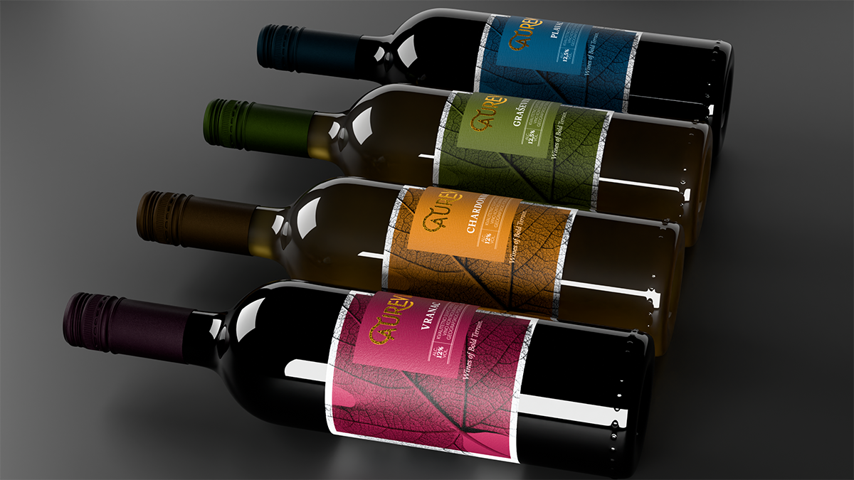
A vine leaf has become the foundation of the visual identity of the new wine brand Aurevia – Wines of Bold Terrain, developed by the Bihać-based Effect Agency for Yimor. The project, featured on the international platform Packaging of the World in early November, draws on the characteristics of different grape varieties and their origins, using the actual structure of a leaf as a recognizable graphic element instead of conventional vineyard, grape cluster, and landscape motifs.
The agency was responsible for developing the entire brand, from the concept and name to a visual system capable of encompassing multiple wine varieties. The starting point was found in the different shapes of vine leaves, whose imprints served as the basis for the label designs. Graševina, Chardonnay, Vranac, and Plavac were thus each given distinct graphic motifs, connected by a shared design approach.
The concept is based on the idea of a terroir imprint, or the visual representation of the characteristics of the environment from which the wine originates. The name Aurevia was created by combining the Latin words aureus, meaning gold, and via, meaning path, while the slogan Wines of Bold Terrain refers to the character of the land where the grapes are grown.
The differences between the four varieties are further emphasized through color. Graševina is represented by olive green, Chardonnay by gold, Vranac by burgundy, and Plavac by blue. Transparent layers on the labels reference the layers of soil, while the logo is finished in gold foil. The system was designed to allow new varieties to be introduced without changing the brand’s core visual identity.
The project brings together a company from Bosnia and Herzegovina, wines from North Macedonia, and design developed in Bihać. Its publication on Packaging of the World has enabled Effect Agency to present its work to the international design community.
Unlike approaches that emphasize the origin of wine through traditional ornaments and landscape illustrations, Aurevia uses a single natural element as the foundation of the entire system. In this way, the shape of the leaf serves both to distinguish individual varieties and to connect them under a shared brand.

