

A chapel in the Upper Town, an abandoned bank in the Oktogon passage, a closed light bulb factory, and a tram that carries passengers from Črnomerec to Dubrava every day. None of these are places where audiences would necessarily expect to encounter an exhibition of contemporary art. Yet these were precisely the kinds of locations that became part of the 60th Zagreb Salon, an event that for sixty years had been associated with the home of the Croatian Association of Visual Artists, better known as the Meštrović Pavilion.
Due to repairs following damage caused by the Zagreb earthquake, the Salon was left without its traditional exhibition space in 2025. The Croatian Association of Visual Artists (HDLU) and the curatorial collective KUĆĆA decided to organize the anniversary edition as a series of exhibitions, lectures, performances, and pop-up events across 16 locations throughout the city.
For agency 404 / MYTY, this meant that the visual identity had to serve two purposes. It needed to express the artistic character of the anniversary edition while also helping audiences find exhibitions that no longer shared a single address. The solution emerged from the curatorial concept Choreography for the Finish Line, the history of Zagreb’s graphic design, and the unease caused within the creative industry by the increasingly rapid development of artificial intelligence.
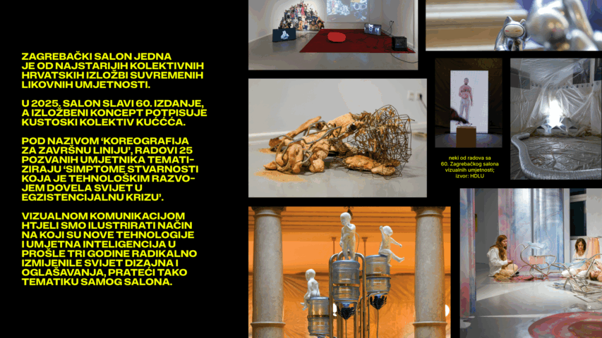
Sixty Years of Design as a Starting Point for a New Edition
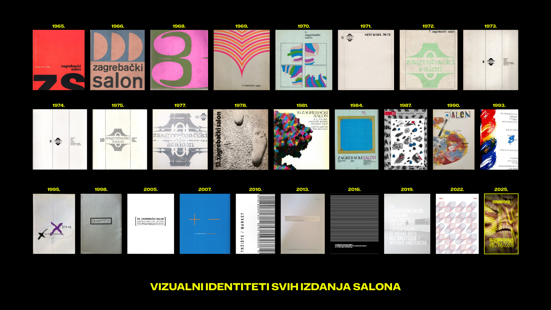
The visual identity of the Zagreb Salon has never been merely an exhibition announcement. Throughout its history, it has been shaped by designers such as Mihajlo Arsovski, Boris Ljubičić, Ivan Picelj, and Milan Vulpe, whose work reflected changes in art and society.
Expressive typography marked the 1960s and 1970s, brushstrokes and clay impressions connected graphic designs with artistic techniques in the 1980s and 1990s, while barcodes and hyperminimalism later commented on the arrival of capitalism.
The team at 404 / MYTY believed that the sixtieth edition also needed to speak about the time in which it was created. They found their direction in the curatorial concept Choreography for the Finish Line, which raises questions about personal optimization, technologically induced identity crises, boredom, and the insatiable desire for something new.
Artificial intelligence emerged as a means through which design could address these themes, as well as the changes already affecting the design profession itself.
Can a Machine Evoke Compassion?
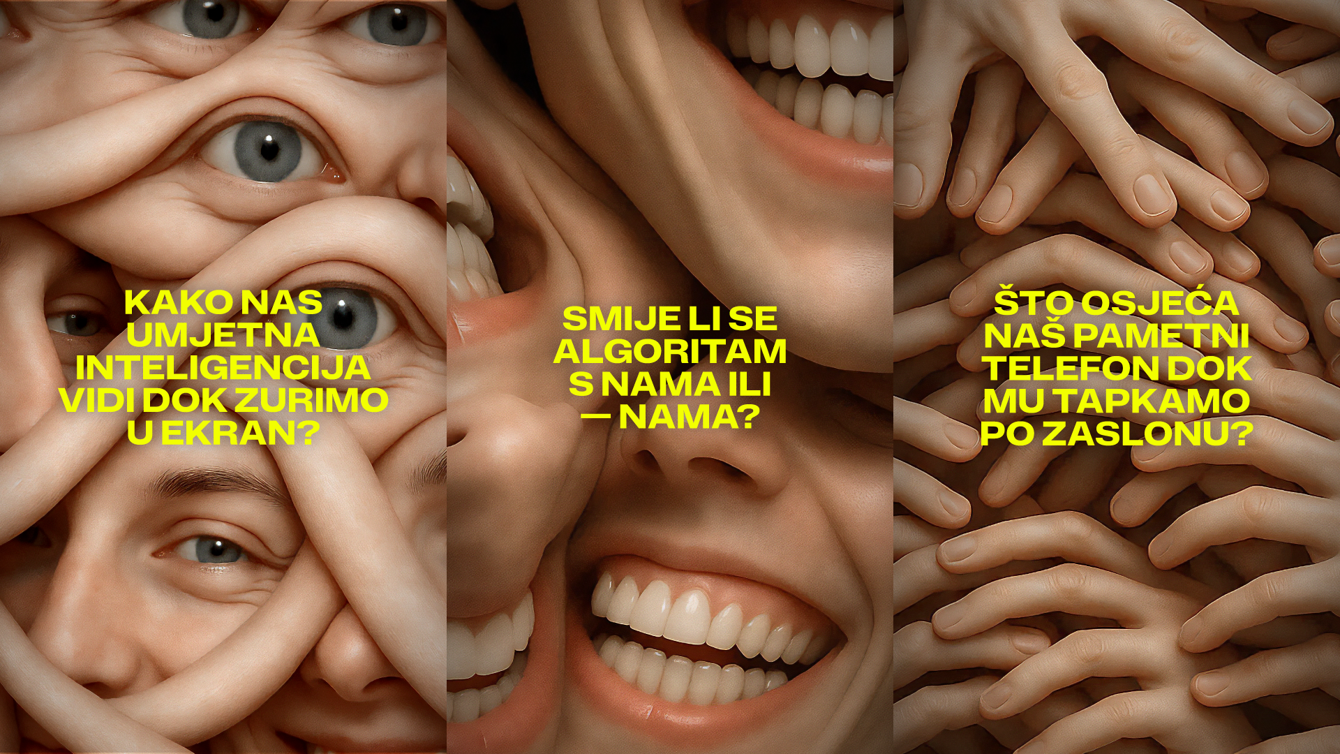
At the time the identity was being developed, generative tools still frequently produced faces with unnatural expressions, unusual gazes, and hands with six or seven fingers. Rather than attempting to conceal these imperfections, the designers decided to explore their expressive potential.
They were interested in the boundary between what we perceive as human and what makes us uncomfortable because it has been produced by a machine. A smile, a gaze, and a touch, three entirely ordinary forms of human expression, became somewhat frightening in the generated visuals.
The team did not want to provoke only resistance to the new technology. Their thinking also introduced another possibility: compassion for a machine that humans had created and then begun to question its existence.
“The reaction we wanted to evoke was not only disgust or defiance toward this new, ‘unnatural’ intelligence, but also compassion for a machine that never asked to be created, yet exists because we humans, in our pursuit of technological progress, created it,” explains the creative team at 404 / MYTY.
This approach also shaped the Salon’s visual language. Artificial intelligence was not used merely as a tool for generating images, but also as a subject that those images themselves comment on.
Three Layers Between History and the Screen
The design solution was organized into three visual layers, each with a distinct function.
The first consists of unsettling graphics generated by artificial intelligence. They form the basis of the identity’s expressiveness and its connection to the curatorial concept.
The second layer features the exhibition title set in Exat, a typeface developed by Marko Hrastovec for HotType Foundry. The typeface references the techniques of Zagreb’s historic school of graphic design, connecting the anniversary edition with its beginnings. The typography was deliberately pixelated and enlarged to evoke a digital screen even when appearing in physical spaces.
The third layer is entirely informational. It includes artists’ names, event titles, locations, and schedules. Its role was particularly important because the Salon’s program changed daily, not only in terms of content but also in the spaces where events took place. The experimental visuals were therefore given a structure in which unsettling aesthetics and functional information did not exclude one another.
A Tram as an Exhibition Space, the Website as a Guide
An exhibition spread across 16 locations required more than a traditional outdoor campaign. Audiences needed a simple way to find artworks, follow the schedule, and plan their visits. That is why one of the project’s key elements became a website featuring an interactive map of all locations, including a ZET tram whose movement was displayed in real time. The program could be searched by day, artist, and individual artwork.
To help visitors navigate the physical spaces, architect Iva Peručić developed a modular signage system made of concrete blocks and transparent plexiglass panels with yellow labels describing the artworks. The same informational elements were used on gallery walls and the website, ensuring consistent identification of artworks across all locations, from traditional galleries to abandoned buildings and other unconventional exhibition spaces.
An Identity That Changes with the Medium
The organizers and the agency wanted to attract as many young people as possible to contemporary Croatian art. The design was therefore developed primarily for digital formats, as motion graphics adapted for social media posts, reels, and stories.
However, the event’s sixty-year history called for careful consideration of printed materials, which had become an important part of the Salon’s design heritage over the decades.
Rather than repeating exactly the same visual across every channel, the designers shifted the emphasis depending on its function. Digital formats used animation and pixelated typography, exhibition signage relied on bright yellow surfaces and legible text, while the catalogue placed typography at the forefront.
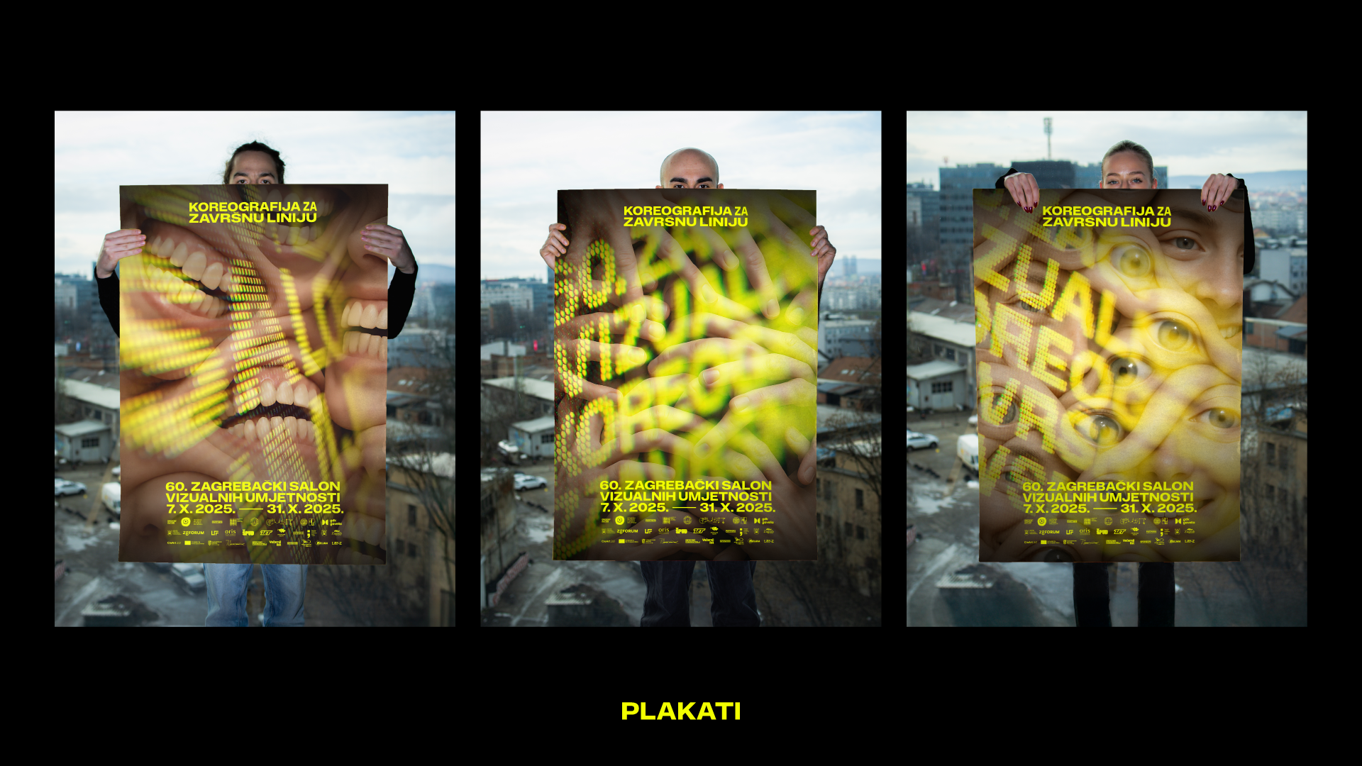
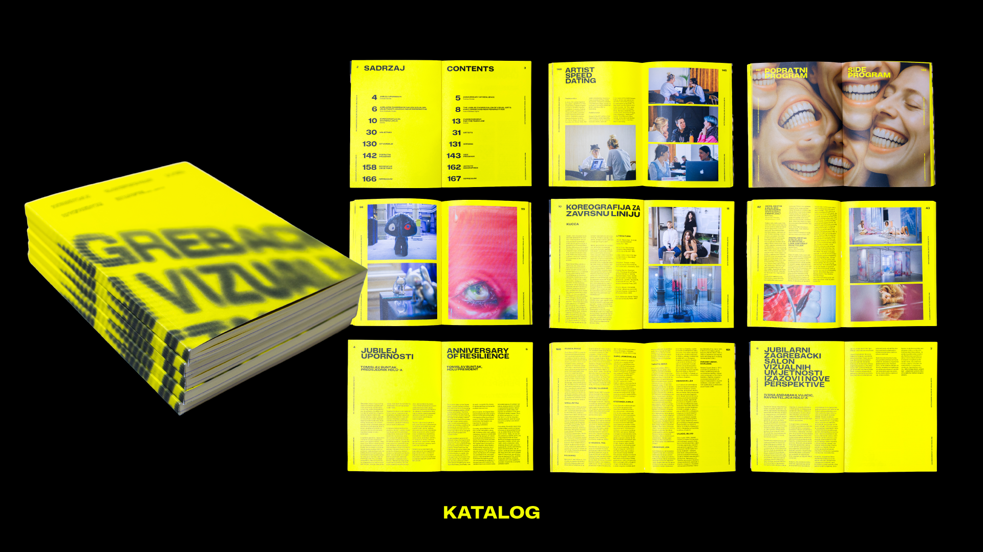
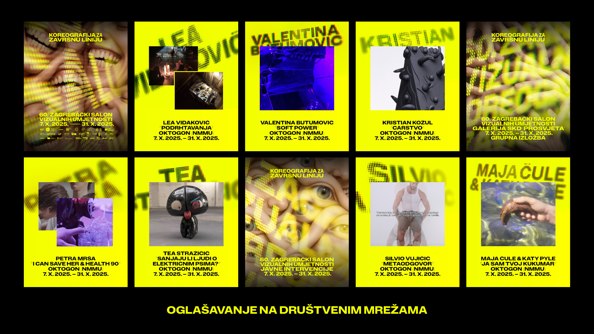
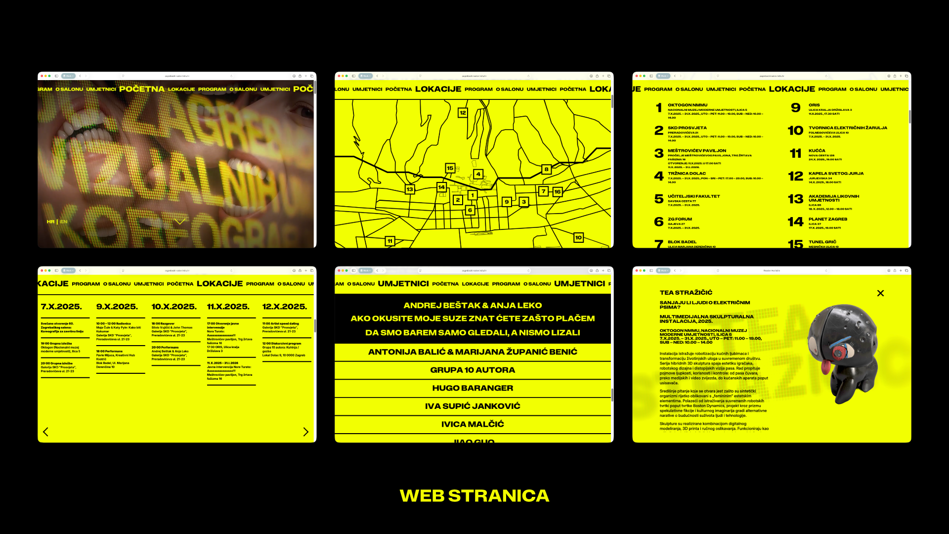
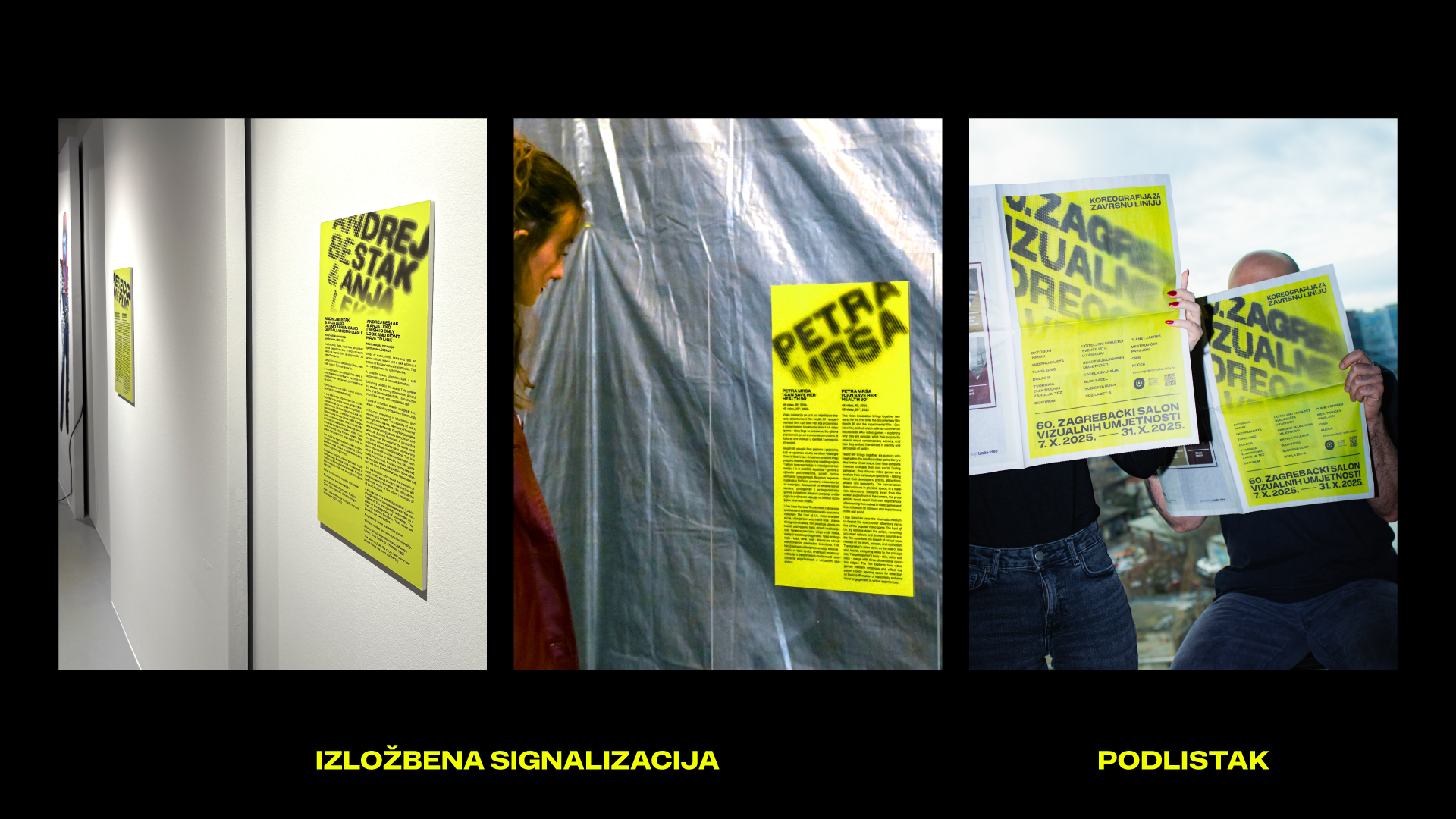
In total, nine motion graphics, around fifty social media posts, several posters, a website, a 168-page catalogue, a 16-page newspaper supplement in Večernji list, exhibition signage, and award statuettes were produced. Each format was adapted to its specific purpose while retaining a shared visual language.
According to the team, the greatest challenge was carrying the hyperactive and somewhat unsettling visuals across so many different applications while ensuring that audiences could always easily find the information they needed.
The Freedom to Use and Criticize Technology
Development of the project began well before the exhibition opened. The agency’s early involvement in discussions with HDLU and the curatorial collective KUĆĆA allowed the designers to understand the curatorial concept and become familiar with the works of the artists participating in the Salon.
At the same time, they were themselves confronting the changes that new generative tools were bringing to the design and advertising professions. That is why, during one of their first meetings with the organizers, they raised the question of whether they could use artificial intelligence in the identity of one of Croatia’s oldest contemporary art exhibitions.
The second question was even more interesting: could they criticize it at the same time?
The answer to both questions was yes. That agreement allowed technology to become more than a production tool and instead take on an equal role in the artistic commentary.
More Than 110,000 Visitors
According to official HDLU figures, approximately 42,000 people visited the 60th Zagreb Salon during the three weeks of its main program. The extended duration of certain exhibitions, lasting until January 2026, increased the total number of visitors to more than 110,000.
The Salon also received significant critical recognition. The editorial team of Jutarnji list named it the best Croatian exhibition of 2025. At Dani komunikacija, the visual identity created by 404 / MYTY won gold in the Tourism, Culture and Leisure category.
For the creative team, it is particularly important that the work was recognized in a year when artificial intelligence began appearing increasingly often among award-winning creative projects. Their solution went beyond using new technology as a production tool, transforming it into a means of expression and a critique of both the technology itself and the industry that uses it.
The sixtieth edition of the Zagreb Salon also demonstrated how much the role of visual identity changes when art leaves its traditional setting. For audiences moving between galleries, abandoned buildings, and public transport, design is no longer simply what makes an exhibition recognizable. It becomes a way to find and experience it.
Creative Team and Collaborators
Clients:
Hrvatsko društvo likovnih umjetnika (HDLU)
Kustoski kolektiv KUĆĆA
404 / MYTY:
Head of Design/Art Director: Dario Dević
Creative Director: Fran Mubrin
Senior Account Manager: Željka Vuger
Senior Motion Designer: Nikola Županić
UX/UI Designer: Maja Štefanić
Web Development: Ivor Delić, Bruno Mataušić
Motion Designer: Mario Malekinušić
Account Manager: Blanka Gojak
Collaborators:
Exhibition Design: Iva Peručić
and KUĆĆA (Jurica Mlinarec, Klara Petrović, Luja Šimunović)
“Exat” Typeface: Marko Hrastovec, HotType Foundry

