

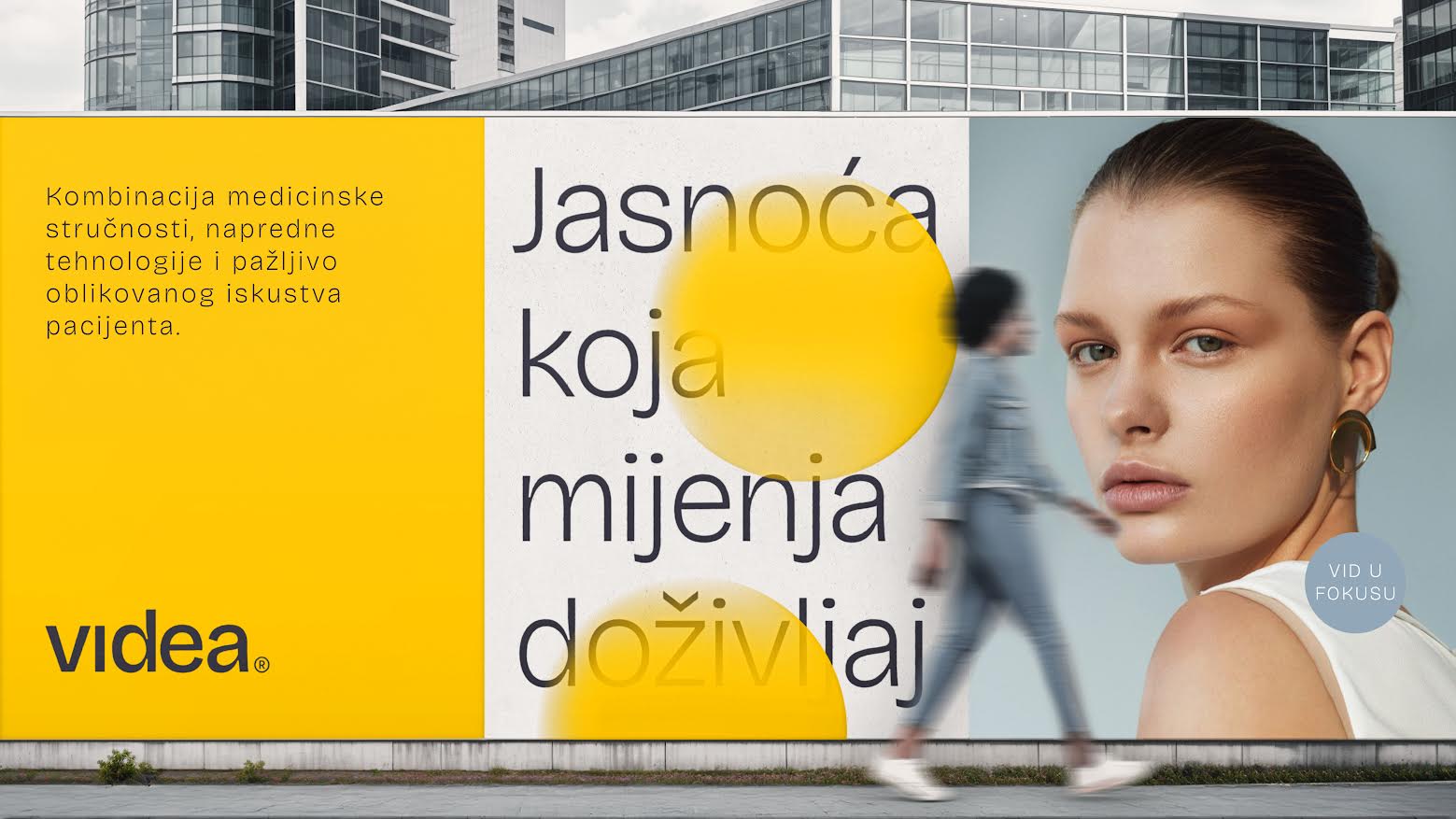
For the visual identity of the new Videa eye clinic, agency Bruketa& started with light as a prerequisite for sight. That choice shaped the colour palette, graphic elements and approach to communication, which focuses on what sight enables in everyday life.
The agency is behind the clinic’s brand strategy and visual identity, and Davor Bruketa, its founder and creative director, explains that during development they considered how to combine medical precision with warmth and a contemporary expression. Instead of relying on literal symbols of the eye and sight, they developed the design through motifs of light, focus and perception.
One of the recognisable elements of this design is a gradient “sun”, inspired by reflections and the way the human eye perceives light. The dominant yellow, named Sun Halo, is combined with Clarity White and the dark shade Retina Night. The palette thus follows the identity’s core idea through the contrast of light and focus.
The choice of yellow also sets Videa apart from blue and white, colours that healthcare brands often rely on to convey expertise and trust. However, according to Bruketa, standing out from others was not the only reason for choosing it.
“Yellow is therefore more than just a means of differentiation. It represents light, clarity, energy and warmth,” says Bruketa.
The change is also evident in the choice of communication motifs. Illness, procedures, doctors in white coats and medical technology give way to clarity of vision and the experience of the world. The visual expression moves closer to contemporary editorial and lifestyle aesthetics, following the decision to present ophthalmological services through their significance for people’s everyday experience.

