


Drugi jezik na kojem je dostupan ovaj članak: Bosnian
The International Jury, consisting of 24 prominent experts from 11 countries, gathered in Essen, Germany, and selected the winners of the Red Dot Communication Design 2017. Record breaking 8051 works were submitted in 18 categories by agencies, independent designers and companies from 50 countries. The awards will be handed to the winners on 27 October at a gala ceremony in Berlin.
Žare Kerin, the Art Director of the Ljubljana agency Futura, has won the coveted Red Dot Communication Design award for the ninth time. This time he was awarded for label design for the in-house wine of Hotel Cubo. He previously received Red Dot awards for designing logos, complete visual identities, books and packaging.
Today we present to you the award-winning packaging of Cubo wine, as well as some other great works by Žare Kerin.
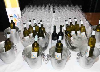
Hotel CUBO, in-house wine
The hotels have developed a unique communications system that strives for universal understanding. That is why we decided that in-house wine of Hotel CUBO should communicate with guests in the same recognizable and straightforward language.
The label in the shape of a door hanger was printed in single color, and data about the wine, such as grape variety, vintage, wine region, etc., are marked on the label with crossed out boxes. The simple solution is relaxing and welcomes the guest in a memorable way.
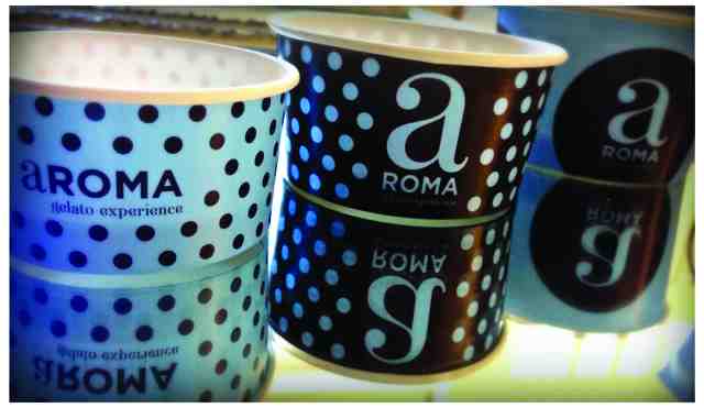

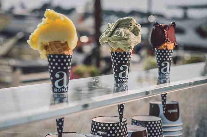
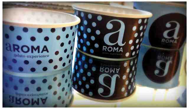
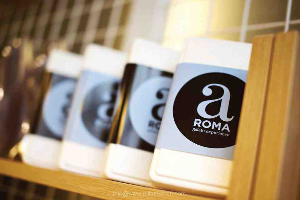
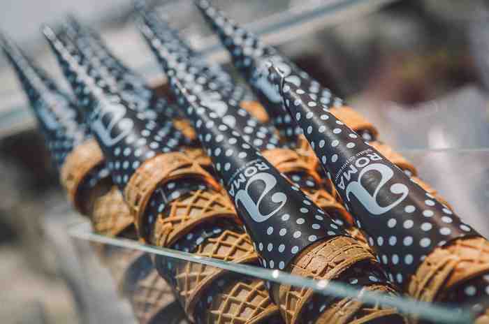
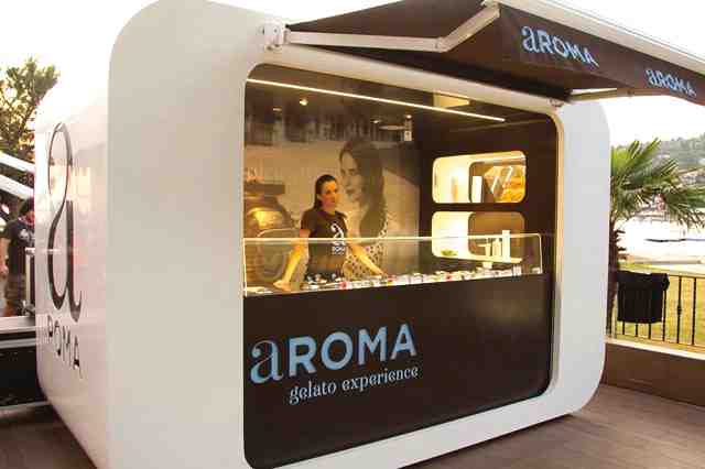
Aroma ice cream and sweets
For this corporate identity, Žare Kerin received the Red Dot 2015. It’s the identity of a brand of ice cream and sweets that works on the principle of FRAN©IZE.
RP champagne
RP champagne is made by a renowned Slovenian wine maker Istenič. This special, jubilee edition was made from Golden Plavec grape variety, and hence the colors in the design.

Spring vitamins and minerals
Packaging and brand identity for vitamin and mineral supplements. Products are intended for women older than 40.

Slovenian Philharmonics
Logo and brand identity for Slovenian Philharmonics.

Opera Ljubljana
Sign for the Opera Ljubljana. After the reconstruction of the building, Žare designed a new logo that consists of the old and new part of the building.

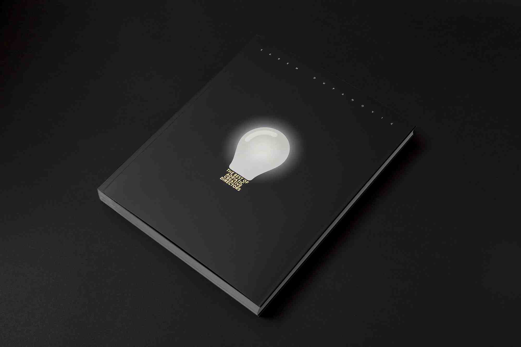
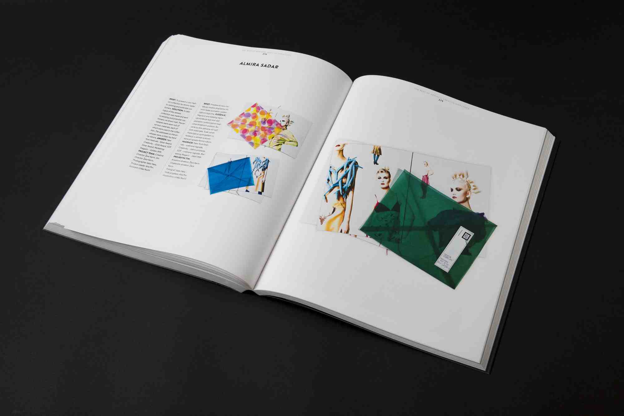
Book The Best of the Adriatic Creative Directors
Design of the book that features 26 creative directors from the Adriatic region and 130 of their most successful campaigns.
Packaging for Kratochwill beer
New packaging for the honey beer Kratochwill. The packaging was made in limited edition for the New Year, with only 1000 bottles being produced.

ECO CLAY Si 14
ECO CLAY Si 14 is a new cosmetic range of products based on clay from the area of Kamnik, which consists high share of silica, hence the mark Si14. Silicon has excellent effect on the skin, which is why it is so pronounced on the product which is also marked by gray color, because only clay with a lot of Si14 has gray color.